27.8.24 (Sue faith Neil Rob Miriam Michelle Sarah Matt & myself)
This meeting there were 6 Students and 3 postgraduate OCA photographers.
I took the opportunity to ask my postgrad and undergrad peers to review my A4 draft submission, book dummy, press releases and publicity material. I posted these on an OCA Padlet and sent them by PDF to the post grads.
There was some feedback on the padlet prior to the meeting:
From Jonathan:
“think the work will look beautiful with the green cover, Niki. A few minor comments on layout, etc.:
The location of the title on the title page is similar but not the same as that of the cover page so jars slightly – could be either the same location or more different? I agree I asked at the meeting and will move the title page down in line with the cover title
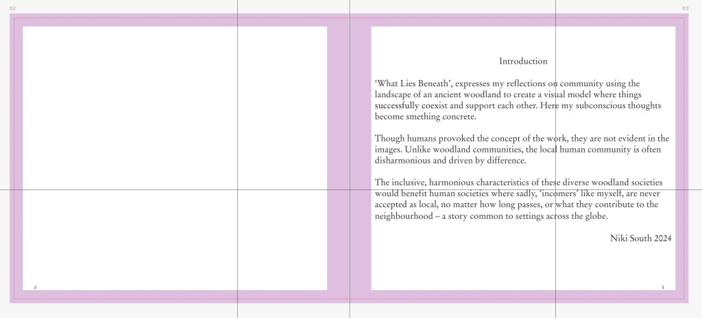
Introduction. Typo: smething (should be something?). Corrected..
Disharmonious/harmonious(try a synonym?). I like the empahasis have left as is
Also repeat of societies ? Have left as is.
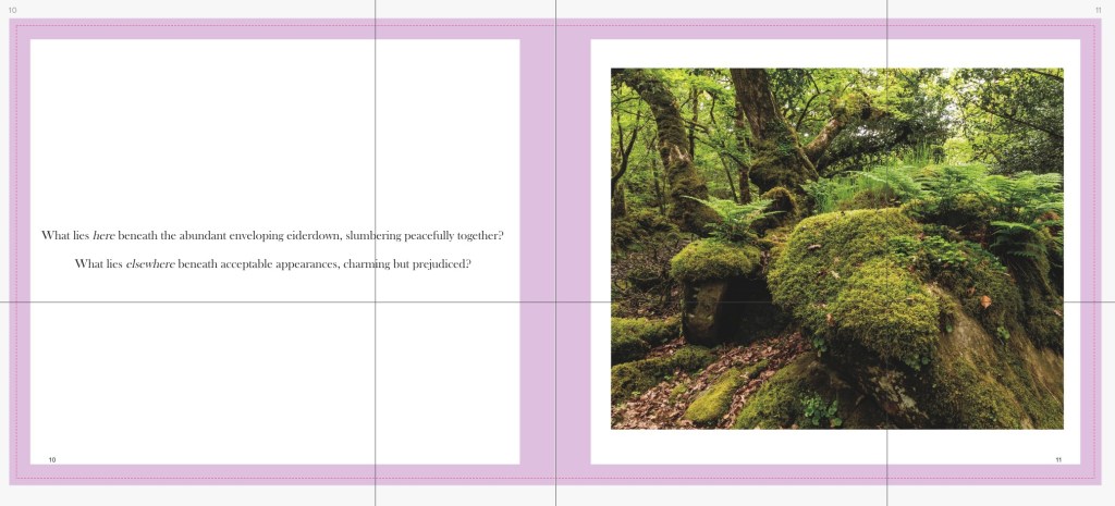
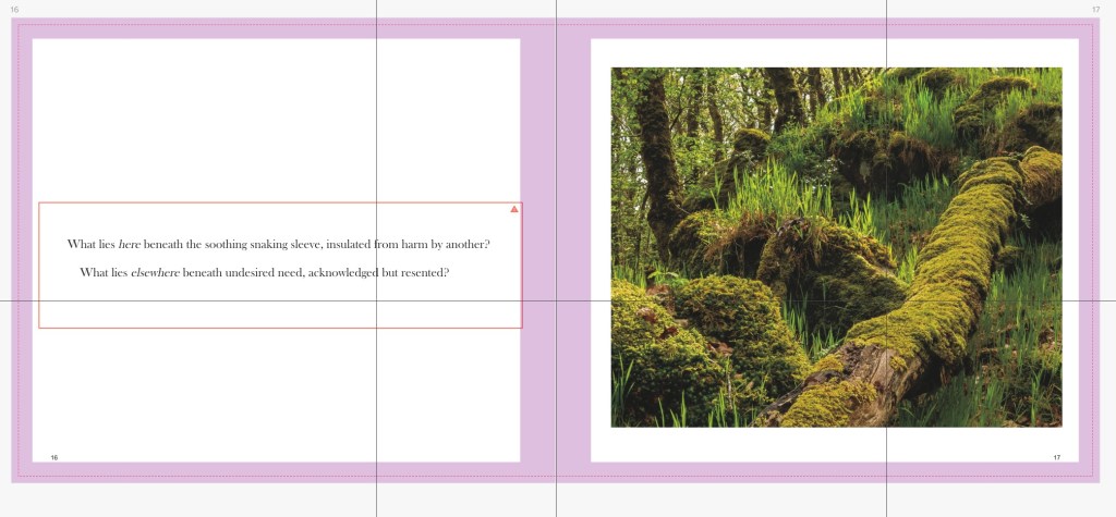
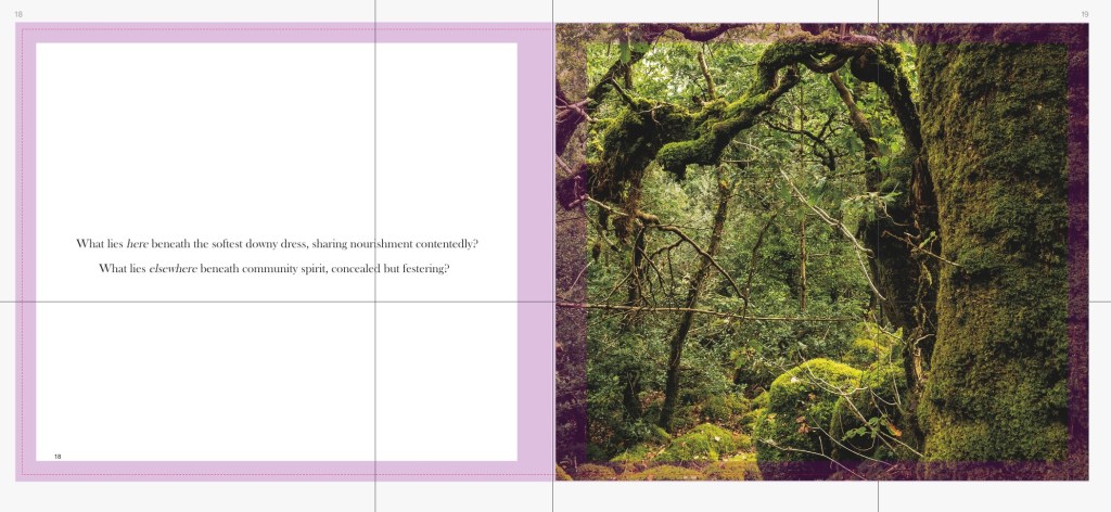
Some of the images are full single page spreads and some are just slightly smaller – again more differentiation might help. Other peers didn’t agree though one suggested increasing the white space around the smaller images, I’ll try this
Not sure you need the poem twice? I asked the group and consensus is to move the poem to the back of the books.
The small images at the back could be four on a page RHS to match the RHS images through the book. This wouldn’t then be large enough but I asked at meeting for other ideas: see below comments.
p.31 image twice could use a synonym. Changed one to’photograph’.
From Miriam:
I’m not sure about the black text on dark green on the cover – more from a readability perspective.
Press release – after a period of reflection, rather than ‘over’ (and don’t ask me why exactly!). Changed.
Drop the quote marks on locals. Done.
Time spent ‘there’ rather than ‘in a place’. Done.
The ‘this situation’ sentence really need to follow the bit about locals rather than the bit about woods. Changed.
you could drop ‘over two pages’ on the Suboart thing, it seems to do that thing of drawing attention in a way that makes me wonder why it’s included. Done
For further information and For additional info could be one? We discussed this at the meeting and I’ll change it.
Postcards look great! Do the lines at the bottom show? if so, can you have one more, because it looks like an exercise book, which I like, but if it is, it feels like it needs another blank line for balance. No its okay they won’t.
Comments at the meeting:
Book dummy:
To put the cover text in cream to increase readability.
To echo this on the section (Tabacco) pages
Try the smaller images with just a little more white space around them
Move the entire poem to the end of the book
Asked about fonts and sizing and all thought was good
Intro place the date below my name. Done
Line the couplet start points up. Done
Footnotes:
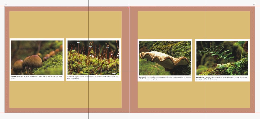
Name something else, suggestions: under the microscope, inhabitants. Changed to constituents.
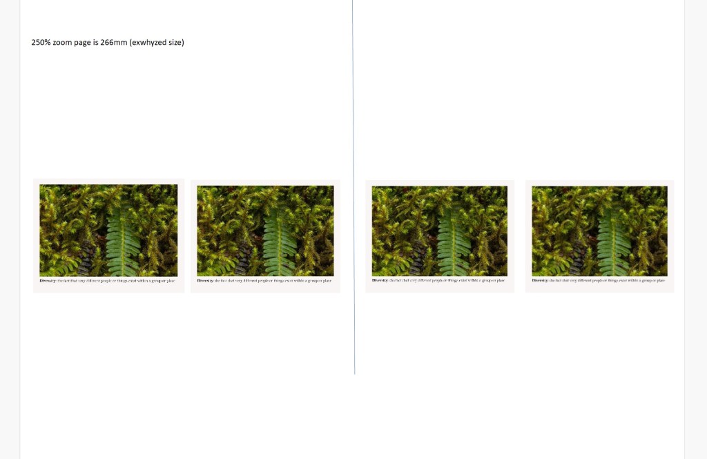
Place the 2 images on a page vertically. Done
Take them off of borders and place definitions in wrapped text by the side of them. This will make them more readable. Done
Place on white page. Done
We had a lot of discussion about the footnotes. A couple suggested I give them more dominance even equal to the main images. Most agreed with me that they are a supplement to the main images and also that it is my main images that I have been successfully “putting out there”. However I welcome the suggestions for reformatting them.
Further thoughts of my own: Try dark green section pages- have done this.
Press release:
Only have contact details once -done on artist talks
Include dates for Artist talks Change my blog. Done and material on talks testing the water
Following on from reviewing my work we had a long discussion about the huge benefits of our peer collaborative/support group. Our thoughts are that it goes a long way to correcting the physical benefits (darkrooms, printing facilities, technical support) that a traditional rather than online university has.
Sue shared the challenges of setting up her postgraduate exhibition.
From 23.7.24 to 2.9.24 I received considerable peer feedback on my Book dummies and press releases, which was helpful and led to redrafts of my project.
The brief: Complete this assignment before the publication of your work. This is your final opportunity to get tutor feedback on your work before it is exhibited or otherwise launched to a wider audience.
Send your tutor a final draft of your work together with the promotional materials you have prepared.
What you send to your tutor will depend on what you’re doing for your publication. Whatever form your publication will take, you must be able to provide your tutor with a good sense of how you envisage it being presented. Any of the following may be appropriate: page layouts; print sequences; installation maquette/sketch; recce shots; web page previews.
Also send to your tutor:
Your artist’s statement about your work.
Your artist’s biography.
A press release for your publication.
Any other promotional material or evidence of promotional activity relating to your publication.
Any strategies you have for assessing footfall and collating audience feedback.
Printing software (Blurb Bookwright). I have downloaded affinity software to use with my final book product with Exwhyzed
Comparing printer’s capabilities, costings and quality (through samples) ready for my end product: Exwhyzed, Mixam, Blurb.
Printer’s design software (moo) when making publicity and feedback postcards
Fine- tuned my artist statement and bio, and gained experience numerous experiences of adapting it for various audience
Adobe my portfolio when building a website and managing the content. I have been contacted about my work via my website
Press releases – by research and writing my own
Putting my work out there through open calls and reviewing with peers and postgraduates also. My work is featured over two pages in the August edition of Suboart Magazine, is to be shown at the Glasgow Gallery of Photography in October and was chosen for the Shutterhub 2024 Yearbook.
I should ‘attempt to engage a public audience with my major project and the extent and appropriateness with which I attempt this’ will affect how my work is assessed. Assignment Four asks me to submit a final draft of my publication, and my promotional material for it, to my tutor for feedback. Assignment Five, which I’ll submit later, asks me to provide a reflective account of I’ve resolved my publication.
FINAL EDIT AND EDITING FOR DIFFERENT CONTEXTS
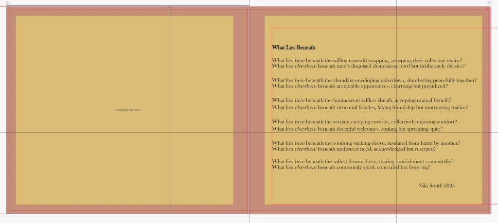
I had a clear concept in mind- What is the work actually about? A woodland community as a model for inclusive harmonious behaviour.
Through my various stages of editing my Body of Work images for each photograph, I asked ‘how does this relate to my concept?
I revised the sequencing for the book layout, after my photobook research. I know it needs a rhythm and a tempo, with quieter images punctuating the ‘louder’ images. My sequence will create a narrative of which I can control.
I should get further opinions, beyond my peers and intend to have a portfolio review which includes my book draft, not just my images. Also I should bear in mind that Non-photographers can make excellent editors as they’re likely to look at what the photograph communicates, rather than how it was made
Due to the local sensitivity of my project, I will not be holding an exhibition, though I am putting my work out there for open calls and I do have work being shown at the Glasglow Gallery of Photography in October and two page spread in Suboart August Magazine which include context and information about the project. I have also featured in Shutter Hubs 2024 YearBook (with only 249 other photographers world wide).
I am going to bring together all elements of my work into a book, which I will share in artist talks locally.
THE BOOK
The OCA course book provides some words of caution:
‘Generally speaking, students who decide to present their work in books don’t actually do a very good job of it. This comment is meant to be cautionary rather than off-putting, because the book is an exciting medium within which to present your work and can really enhance the narrative of your project’. (OCA SYP course book:P69)
I have prior experience with making photo books, with an online print-on-demand company, Blurb. The coursebook suggests:
‘Whilst Blurb is an invaluable resource for both making and distributing photo books independently from a traditional publisher, you may not actually be aspiring to publish or market your book, and are perhaps looking to create something that is much more individual – more of an ‘artist’s book’. If this is the case, then you may wish to retain complete control over the process (size, orientation, materials, etc.) and can supply your own pages, using exactly the paper stock and process you desire – most likely inkjet prints’
I realise that creating a photobook isn’t as straightforward and that some photographers who self-publish their work, commission specialist designers to work on individual projects to bring a different perspective to a body of work, and knowledge of architecture of the book, materials and typeface. However, as I’m not selling books and want to keep my costs down I will do the very best that I can with my own research which is evidenced in on my blog:
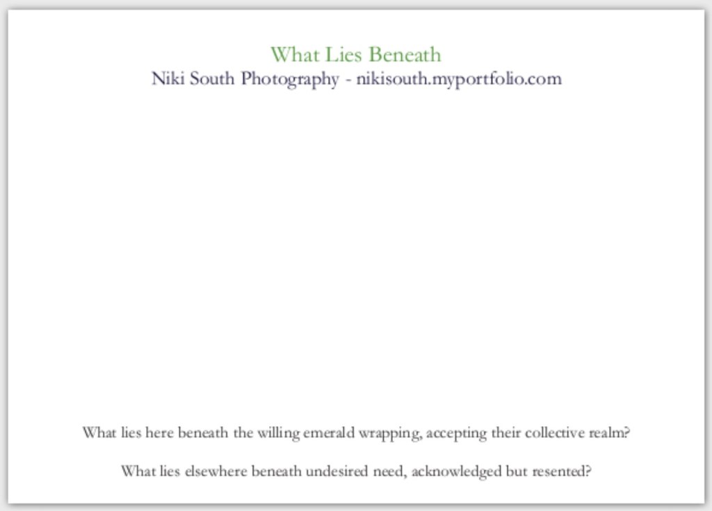
Why do I want to present my work in book form? It brings together my images and poetry (the concept) in a format where I can control who views it – I do want to share it during artists talks locally due to the sensitive subject matter.
What is it about the book, rather than a different medium, that particularly complements the narrative of my project? I intend my work to be reflective and an intimate object such as the book can be viewed over and over in different settings supports this ethos.
How can I maximise the photobook unique qualities to enhance the narrative of my project? Sections and footnotes can enhance the signposting of the concept of the images, to add to that given by my poetry.
After extensive research on photobook publishing I have sdecided to self print using an online printer, probably exwhyzed. I have made a PDF preview and one copy as a maquette (using Blurb printer) of how my book will be laid out, considering scale, sequencing, text and colours. This is relatively inexpensive.Then I will use either Mixam or Exwhyzedto make a more professional quality/appearing self published book.
I built it using Adobe portfolio, so with no annual fee for a domain name and after a few days of research and trials I achieved what I wanted to.
I am aware that my website is a first port of call for interested in my work and considered:
Professionalism: I believe it stands up well against other photographers websitess.
Content:
It has a landing page
About page: With my bio
Portfolio page: one for my major project What Lies Beneath and 1 for an earlier work Brexit. Both include introductions to my work.
Contact page:
Visual strength, I considered:
Considered typeface
Layout
Colours/tones
All peer reviewed and spent time looking at other photographers’ websites
I have checked how my website looks on a variety of devices.
Navigability is simple and obvious.
It is simple to refresh e.g. my your portfolio, bio, CV.
As I do not intend to sell my book it will not be encompassed on the website for sale- though I may mention that artist talks are available with a personal showing of the work in a book.
Apparently I can get Get Google Analytics (free) on my site to see where people are visiting from, what content is popular, what search terms people use to discover your site, how people move around the site. I need to look into this.
Social media and enhancing my online presence
I have previously considered some of the suggestions from the coursebook below:
Instagram – I began a professional photography Instagram earlier in the year and am posting on it and extending my followed and followers. I have a widget for it on my website. I will add it to my blog too
LinkedIn – I have updated my profile to include my photography. I will see going forwards if I need to use it to seek specific professionals or direct them to me.
My facebook remains a personal rather than professional tool, and is geared towards local contacts so is not appropriate for the engagement that I want for this work.
Vimeo, which I have used previously, I will bear in mind should I want to embed video on my website.
Twitter – Can take a very long time to acquire enough followers on to make meaningful contributions towards your publicity, so at this stage I am not starting this now. Should I change my mind in the future about how much I want to engage with an audience going forwards then I can revisit the idea.
Traditional media and press release
If I wanted wide local engagement I am aware that I could advertise locally using event listing websites and publications. These would be:
The local facebook ‘who what where when’
The well-used village telegraph pole
I could also contact the editors of my local newspapers like the Western Telegraph
None of these are appropriate for my project/book which is sensitive locally. However in a press release I would address:
What is the work about?
Why is it exciting and worth reading about?
Who I am – my background?
Why I made the work?
When and where can the work be seen? (physically and online)
Where will I be available for interview or comment? (Croaker, 2016:65, Broken OCA resource link)
I have written a theoretical press release for my book and a press release for my artist talks, These have helped me to focus on the important points that I need people to know.
If a gallery or organisation is hosting an exhibition of my work, I will be clear which of us will contact which publications and listings.
Agents and other marketing opportunities: I am aware of photography agents, though they are not appropriate for my project.
WRITING MY ARTIST’S STATEMENT
I have honed my artists statement over the past few months and constantly adapt it to the requirements of a particular audience or open call. Give examples for an LO?
I have written an introduction for my book that functions within that context, and adapted it for my press release for artist talks, probably written on postcards.
They:
Address the core themes that the project addresses.
Address only the current work
Address the audience, as they may be mainly not photographic professionals locally.
are enthusiastic, and stress the importance/relevance of the project.
Dont impose a definitive statement of the work’s meaning on your audience. Leave some intellectual space to engage with it and draw their own conclusions.
Gathering feedback my your publication after it is ‘released’ is part of this process and will
help me assess the success of my publication – how much my work has managed to communicate the ideas or explore the themes that you set out to. I think this, rather than the numbers of visitors will be more appropriate for my work.
I can also use this feedback to help reflect upon how to develop the work further, or where or how I might exhibit it in the future.
Reference:
OCA (?) Sustaining Your Practice Part Four: Resolving and Promoting your Publication Coursebook. Barnsley
I have had postcards printed to use for promoting and personally inviting people to my artist talks. They will also be given at the end of talks to invite written feedback.
The fronts of the postcards are of 4 designs so attendees can choose one they like, including a bonus new image.
These are on 350gsm card, the fronts are uncoated so I can write personal invitations on and they can write their feedback on, the fronts are in gloss as the images will then “pop”. They are A6 109 x 152mm in size\;
The book press release below is a theoretical exercise at the moment for reasons that I have outlined in my learning log, as I don’t intend to sell my book at this stage. Whereas I know I will need a press release for my artist talks.
I must show why this event is significant, to persuade a news editor, art critic, or journalist to write about what I am doing, and audiences to attend my artist talks. Consider how I can hook a reader into my project, with detail into as few words as possible.
Process of drafting & reviewing to the final versions
Important:
A complete news story
One page only
Write in 3rd person
Include images – named
Year art made
size of work
include copyright notice
contact information for more information and to request images.
quotes about your work with a note of the source
Format:
Headline/title – include PRESS RELEASE in wording
My name/book title/venue/location/when
Image link to others (website)
Sub-headline: one line explanation
Lead paragraph : Who (Bio) what when where how and why – not my artist statement
1st para: short explanation including interesting points
further information section , includes contact information
Separate document provides image information for editors: This is a final section of bullet points that emphasises the important parts of your press release. Essentials:
Artist, venue
location
when
unique image file name
Year of work
Size of image
Material
note if using a book seller, they will provide some details but rarely link to an artists web site or social media spaces. I have written a theoretical press release for my book as well as a press release for my artist talks
Final versions, revised following 2 drafts and Peer feedback:
The ‘this situation’ sentence really need to follow the bit about locals rather than the bit about woods.
you could drop ‘over two pages’ on the Suboart feature, it seems to do that thing of drawing attention in a way that makes me wonder why it’s included.
For further information and For additional info could be one?
after a period of reflection, rather than ‘over’ (and don’t ask me why exactly!)
On version 2:
Press Release v2 — looks fine to me. Just say Book Launch – What Lies Beneath by Niki South (you mention you photograph the woods later).
LO1 demonstrate comprehensive knowledge of the professional context(s) relevant to your practice and have an understanding of the professional dimensions that underpin a successful photographic practice.
Having taken advice for many photographers on best companies for self-publishing and have narrowed it down to Exwhyzed and Mixam, and have invested time researching what they offer.
A SUMMARY OF MY NOTES ON EXWHYZED PRINTER :
From their intro video for zines
Binding up to 40 sheets:
wire/saddle/stapling stitching:
a sheet will be 4 pages (4 page cover). Need multiples of 4 pages for this zine.
Self-cover is same paper throughout.
Can have a 4 page cover which is stiffer/thicker but cover does bounce up
A4 16 pages is neat
Perfect binding: glued cover is continuous spread with a hinge which should open flat
40 pages (includes 4 page cover) is a 3ml spine can’t do for less than 40 pages total, need 170g for cover.
Cover:
Laminate front cover if go for 170g or thicker to stops spine cracking.
Matt (though feels professional does scuff) or gloss (pops the colour ü) or soft touch (looks professional).
Recommend flat colour 160g for thinner zine or uncoated 300g for thicker zine but matt laminated
Size:
up to A4, 297 x 210mm, but suggests between A4/5 is a nice size.
Bespoke sizes stand out from other books
keep text 10/12ml away from edge 6/8ml lost on into spine
Paper types (house types)
Uncoated (no shine, white), silk (good middle ground, colours jump, slight sheen, smooth), gloss (shine), & evolution uncoated (off white, soaks up ink, not good for dark prints and colour reproduction) 100g (170g max for pages) to 350g chunky cover (300 best max).
Blk/wht recommend only uncoated or silk
Page numbers sugested 5/6pt nice and small
HARDBACK BOOKS
Case binding
Hardbacks are little larger (V perfect bound softback as cover overhangs)
Inside the front/back cover overhangs the hard cover by 17mm, though majority is covered by the end paper glued to cover case. So will need extra 17mm round the edges.
Can have content on all 3 pages of the end pages.
The first text page is actually glued to the end papers not the bookcase, so lose 5mm of the first text page therefore content should be at least 10/15mm away from the spine, ideally 20mm so the page doesn’t have to be pressed down to be read.
28 minimum pages for a hardback ideally 32. Or not enough surface area for gluing – this gives 3 mm spine.
can be shiny paper from colour plan, and the edges also takes the colour
Printing the colour on the end page is considerably cheaper– means can have any colour, though do see white edge (from the side).
Inside pages
silk ideal for my colours
Standard paperweights: 115 gsm uncoated, 120 evolution uncoated recycled, or 130 silk. Premium Upgrades: 160g evolution uncoated (recycled sucks in ink), 170 house uncoated to 170 silk makes it easier to glue with small number of pages. 12ml border ideal or full bleed (but do lose some image in the centre fold)
Captions suggest 7/8 pt
Stop 15/20 mm short of spine so pages don’t have to be pressed down. Later they said for my 9mm spine it would only be a 2/3mm loss
If an A4 Landscape photography book, though suggest bespoke sizes say 260 x210 better
15/18ml round edges(might be too large for me)
130 silk paper silk is safest for colour reproduction
They send me 1 page at least to check how images print – allow extra week if checking prints, hardback takes 1 week normally and linen an extra week foiling another – so 2/3 weeks for hardback line/foil book.
Apart from full bleed keep the others the same place margin
up to A5 is one set of prices, including any bespoke size, no extra for bespoke prices. The same goes for A4.
8 X 10 good landscape photography size bespoke from A4 or A5 makes the readers eye work harder.
Lithoprint is used only for longer print runs.
I like the size of Lucy Roses ‘no words left’ book?, which is slightly bigger than A5 landscape, but having measured it out, though cheaper A5 is too small for my images.
I definitely don’t like more than one image on a page
For preview they offer a print preview PDF for proof reading prior to printing/payment.
I must ask how to avoid getting the end pages the wrong size like ode to Hackney in their video example.
Tips:
Images: Might need to boost contrast for printing in photoshop
More white space round text is better
I asked XYZ for a quote based on:
Hardback photobook
Size: Landscape 210 x 262.5mm or could be 210x 260 want to achieve near to 5:4 ratio
Case bound-glued
Cover: printed 170 silk laminated hardback gloss – Also give alternative quote for if a colourplan cover with foil for text title
Printed end pages silk 170g
32 pages 170g silk
1 or 2 copies only
Their quote was:
210 x 263mm Landscape Casebound Books – I then realised I should increase this width to possibly 210 x 279 to allow for (15mm loss into spine on full bleed images. (A4 is 297×210)
Cover onto 170gsm Silk FSC Certified
Wrapped over greyboard case
Gloss Lamination to outer
2x 4pp End Papers printed onto 170gsm Uncoated FSC Certified
5:4 =210 x 263 so Quote: 210 x 279 would give 15cm to lose in the spine and allows for 2 ‘parts’ images to go side by side at 5:7 ratio and approc 25mm for spine . They replied that 2/3mm is enough for my 9mm spine so I may make a 210x 266mm book.
Method of printing and printer? Indigo same as Mixam
Gutter sizes no print zones? What about full bleed? They sent advice on how to do.
Note to self: Have to use affinity or indesign software
The information that I gleaned from Exwhyzed, was helpful and enabled me to do a comparison of what they offer. I sent for their paper samples.
MIXAM PRINTER summary of notes:
I was alerted by a photography photobook maker to them and investigated. I sent for their paper samples.
I want to make a draft version of the book to test the layout initially and they appear cheaper than Exwhyzed.
Mixam offers:
A print preview file which would be eventually sent to the printers – downloadable
A sharable by link flipbook
This would work for sharing with peers and tutor.
Mixam also will only do a hardback case bound/glued for the 28 pages minimum with 200g paper. Though for 32 pages I could have 170g silk the same as ‘XYZ’.
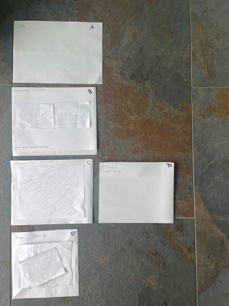
They only seem to offer certain sizes, not bespoke. I would like something close to A4 but preferably with a near to a 5:4 ratio:
A4 = 210 x 297mm
210 x 210mm square – I considered but decided its too small
‘Letter’, 216 x 279mm is a good possibility– the ratio is close to 5:4 (which on 216mm length would be 270mm width and I will possibly lose 15/20mm in the spine, so 279 is a good size for 5:4 photos and full bleed. This width may allow me too much near the spine for a 5:4 full bleed and I may have a white space?
Quote is for £56.50 print on demand extra copies £11.50, or order a multiple to save postage. And need to register for on demand if needed
Q: Do I need to add 4 more pages for the quote/template or is that adjusted already by me adding a cover? A: They add them, I would order 32 pages.
Q: How deep will the spine be? This is shown after added to cart – It’s 9mm
Q: Can you have a page printed to check the colour? No This is a flaw though If went Mixam can afford to print 1 for use even if adjust again for final copies but cost wise then need to stick with Mixam
Q: Do they have any video files on how to do? See how to start a book/order
Q: If add head and tail band is it just aesthetic? Yes
Printed on Indigo 7800 digital
Do need software for best results. See how to start an order
The process: Upload – then payment – confirm or cancel then have flip book available and proof pdf can download
Other considerations:
which preview would be best for a portfolio review or will I get the book printed fast enough for initial artist talks?
Might need to brighten for paper printing – I have done that on my images for print.
DECISIONS:
My book will be hard back (essential for taking to the woods for my artist talks), 32 pages.
Either 216 x 279mm, which allows 9mm extra on the width over a 5:4 ratio (Mixam) or 210 x 266 mm, which is 3mm over a 5:4 ratio (exwhyzed) depending on the answers to queries that I have out, and my budget decisions. Exwhyzed say2/3 mm only will get lost in my spine so I may have too much spare in the mixam letter size?
I would prefer a linen cover foil embossed but the cost is extremely prohibitive so I will go for a print gloss cover.
Print company comparisons:
Mixam
Exwhyzed
Hard cover Matt laminated 2 x End papers (quality unknown) Stone colour (natural)32 inside pages Silk 170gsm pages 9mm spine Printed in full colour Casebound Head and tail band (aesthetic) 32 pages
Cover onto 170gsm Silk FSC Certified Wrapped over grey board case Gloss Lamination to outer 2x 4pp End Papers printed onto 170gsm Uncoated FSC Certified 32 inside pages onto 170gsm Silk FSC Certified (9mm spine) Printed in full colour throughout Trimmed, collated and case bound 32 pages
Quote: £56.50 one copy +£11.50 extra copies
Quote: 1 = £226, 2 = £238, 5 = £256
The price differential is huge.
Quality differences: Mixam is a matt laminated cover Exwhyzed gloss
Process differences: Exwhyzed will send proof pages for colour checking – however at Mixam prices I could afford to adjust and order another and still save approximately £150
I am currently evaluating the quality and availability of their support services as I will be using affinity for the first time
Blurb
I decided to use Blurb to make a maquette for review in the meantime, as its cheaper and timely – though the quality is not what I want for my end product. It will also give me a pdf preview that I can share for feedback.
I can’t get the exact dimensions of my final book, above, but it will be near enough for my draft.
The draft book is their standard landscape size of 200 x 250mm, 5:4 ratio so I will get a little loss in the spine.
I will use the nearest materials that I can get to my final choices:
Hard cover, 20 x 25 mm 32 pages on mohawk proPhoto pearl 140gsm (semi-gloss) , casebound, endpages? Cost £35
End pages will not be ideal as to make a budget maquette I must take their default standard mid-grey, unless the upgrade to white is very low. Also the have a logo page as a separate sheet added as the very last page/sheet in the book, which can be white (as a maquette I am not paying 25% to remove this)
I have visited several book fairs, most recently Ffoton in Cardiff and BOP in Bristol. I have a good collection of photo books of course and keep up to date with those published and online reviews.
My latter period of research into photobooks coincided with my research on my A3 enquiry into printers v publishers.
I am concerned in this research how the a subject of a photobook relates to its physical item, rather than reviewing books for their art/text content. I have sought some books of a landscape/equivalent subject matter and some that I like the aesthetics of. I have looked at the images have been assembled, how rhythm and tempo are achieved, and interest is maintained .
My inspiration:
Jem south Four winters (2021): hardback, 300×230, 124 pages, linen cover, embossed title.
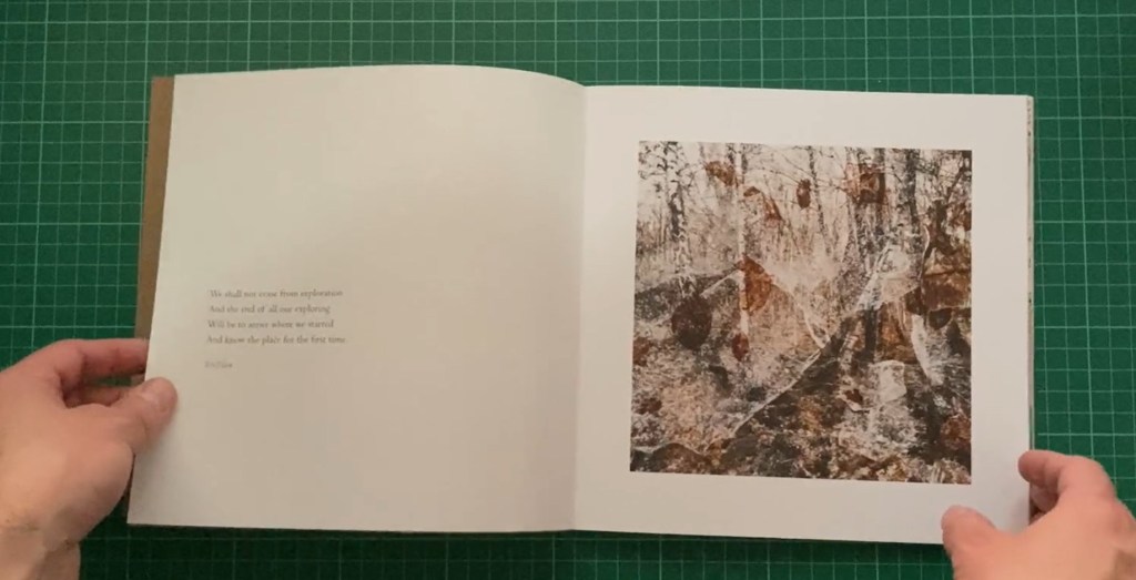
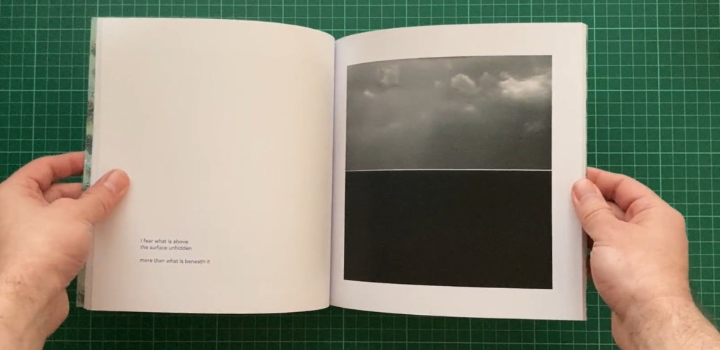
This is a ‘clean’ read. The images are all aligned and are mostly on the right pages. He uses white pages with titles to separate elements of the book. There are no page numbers and no image titles or captions. The colour images work well on this silk paper.
Southam, J. (2021) Four Winters. Stanley Barker. Scotland.
Jeffrey Conley. The shadow’s veil (2024). Hardback, 104 pages, 305mm x 355mm, linen cover. The book is a collection of observations about the unfolding of days. It is black and white, and again fairly ‘clean’. The images align on pages except for some full bleeds. I particularly like space around the smaller images, it seems to bring attention to them.
The Land is Yellow, the Sky is Blue. (2023) Marc Wilson. Self-Published. Softback, 108 pages, 200mm x 250mm
‘Is based around a small village in central Ukraine. It and text combines photographs with text written in the shadow of the current war. It has dark end pages printed on in white. Images are a variety of sizes, generally aligned on the right pages apart from those that spread across 2 pages. Some of the images have too much white space around them.
This is a beautiful book with a hard cover and American dust jacket, thread binding. Inside Paper: Munken Lynx 150 gr Cover Paper: Arctic Volume White 130 gr. Cover: 2 mm cupboard + 300 gr. grey carton. Book Cloth. It however signed and expensive so the materials used can be justified. The fact that she is a fine art photographer shines through.
Extensions of photographs with hand drawing, mash-up of the representational and the non-representational. Pace and sequencing of this photobook is varied and engaging, so the reader doesn’t know what the following page spread will reveal – Single images, paired images of the same subject, montage of print and objects, full page bleeds or a photographic image spanning the the two pages with a classic white border. The book is Smyth sewn, which is good for a double page spread where none of the photographic content is lost in the middle gutter.
I like the variety of alignment and sizing of the images, though I don’t like it where two are on facing pages. She does use 4 smaller images on a two page spread as I intend to.
And see the third in her series that continues her investigation of a riverside park in Vienna: Root & Waltz, (2023).
Root & Waltz, Regina Anzenberger (2023). Self-Published (AnzenbergerEdition), Hard cover with (American) dust jacket over boards, thread binding (Smyth sewn), signed and numbered edition of 350 copies.
Brydon. A (2023). As We Wander. Another Place Press. Scotland – Softcover, 40 pages,150m x 200mm
Printed image on cover, black and white landscape images, varied image size and placement. I love the work of Brydon and his colleagues who work with the inside the outside collective. Again, this book appears ‘clean’. No page numbers, no captions. The black and white images work well on what looks like uncoated paper. There is something about the variety of image placement that sits well with me; images are aligned except where they spread across 2 pages or are full bleed. Unusually I don’t object to there being at time 2 images on a double page here.
Passage. Guy Dickinson (2022). Publisher Another Place Press, 245mm x 200mm.
Another contributor to the inside the outside collective, Dickinson’s photography attracts me. This is a softback and in black and white but it’s simplicity attracts me. The images are either full bleed or for the first part of the book have a white space around the images up from the bottom of the page. This irregularity in placement draws you to them.
Cubby’s Tarn. Joseph Wright (2017). Publisher JW editions (himself), Edition Size 500, 240 x 325 mm, Approximately 80 Pages. Hardcover.
Another contributor to inside the outside collective whose work I admire. This book I own a copy of, its most things that I love. Linen foil embossed cover. Natural brown paper end papers and section separators -simple white pages otherwise, with images variously placed and sized.
Nicki Gwynn-Jones (2018) Self-Published, 305mm x 240mm, 96 Pages, Hardcover.
An example of a larger landscape book, which I’m not keen on though it does accommodate 2/3 images easily side by side on a page. I don’t like the printing on the inside back cover, it makes the whole book look poor quality and self-printed.
Hidden Layers of Perception. Alexandra Wesche (2022). Self-Published, Edition Size 25, 210mm x 210mm, 40 Pages, Softcover.
The images are multiple exposure photographs taken in a forest. I am amazed this is self-published. The design and papers are exquisite., she has even been able to use some transparent overlays. I’d have thought it handmade except that it is an edition of 25 copies. I love the cut-out cover, and some variety of image size. No page numbers or captions and minimal text.
In The Offing. Fiona McCowan (2022). Self-Published, 210mm x 210mm, 52 Pages, Softcover.
Once again I am drawn to a square book. The printed cover this time looks classy. Images of the sea and its horizon are aligned on the pages and either facing or on the right page. The text is bottom left on facing page and section pages have text to the right and not too large.
Meadow Nicholas Pollack (2023) Hardcover book, Offset printing, 112 pages; printed in Italy by Trento,Paper: gardamatt art 150g/m, 10.25 x 8.25 inches.
His book of images of places and portraits are mostly aligned, no page numbers or captions.
Blue Violet. Cig Harvey (2021). Publisher Monacelli Press, 231mm x 288mm, 208 Pages, Hardcover.
I visited this book as Cig Harvey’s ‘You an orchestra you a bomb’ is my favourite photobook that I own – more on this to come.
Blue violet has a printed cover, the whole book is an assault by colour on your senses, just as the above book. The silk paper does pop the colour. I should consider printing my end pages/section pages in a strong colour (Tabacco?) and printing text in a lighter colour? Just a thought.
‘You an orchestra you a bomb’ (2017) Schilt Publishing; 144 pages, 230 x 23 mm.
Is again a colour assault on the senses, with a lovely linen cover in a vibrant yellow. Again with deep coloured pages every so often and printed on lustre paper.
Harvey, C. (2017) You an orchestra you A bomb. Amsterdam, Netherlands: Schilt Publishing b.v.
I could use a square book and take my full bleed images across the page into the other page, but 210 x 210 (exwhyzed the maximum size I can afford) is too small to take my footnotes side by side and be able to read the definitions, and Mixam 300x 300mm (the next size up is too large). I also want to accommodate effectively my 5:4 ratio images.
Linen embossed cover, but that’s out of my budget.
Natural paper end pages and section breaks (can Exwhyzed do?) or deep vibrant colour
White pages
Regular alignment of images with only a few breaks
‘clean pages’ no page numbers or captions
Space around non bleed pages
Silk paper
1 image only per double page – apart from the footnotes which are a different enitiy.
Consider placing the medium sized main images up from the bottom – not even
Text fairly small
I need some irregularity to make the eye work, I know that deviating from an A4 or A5 format does make the eye work and engage you. I need to ensure that the pace and sequencing of this photobook is varied and engaging.