ASSIGNMENT FOUR PUBLICATION DRAFTS: Review/revision process for creative presentation of images

LO2 coherently present a body of work, making creative presentation decisions that complement your subject and/or your artistic strategies.

Process of revising images & creating complimentary presentation for final SYP output – Photobook

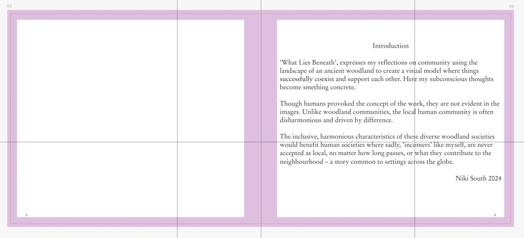
I had a clear concept in mind- A woodland community as a model for inclusive harmonious behaviour. Through my various stages of editing my Body of Work images for each photograph, I asked ‘how does this relate to my concept?

Part 1: Transforming BOW images into a coherent series of images

(See final Pdfs book proofs sent to printer at bottom of post)

I began by editing my BOW images for SYP. I asked my peers for their input as well. Peer critique session 24.2.24

Brief for peers and their comments:

Made with Padlet

Editing board shared with peers:

Made with Padlet

Outcomes: They suggested I exchange 2 images for those with extra dimensions of woodland for context. I asked their thoughts about the ‘signposting’ in the work & consensus was that it was the right level. They thought my reworked ‘footnote’ images didn’t need any changes. They are now more consistent than before (lighting/perspective). I fed their review ideas into my next editing decisions:

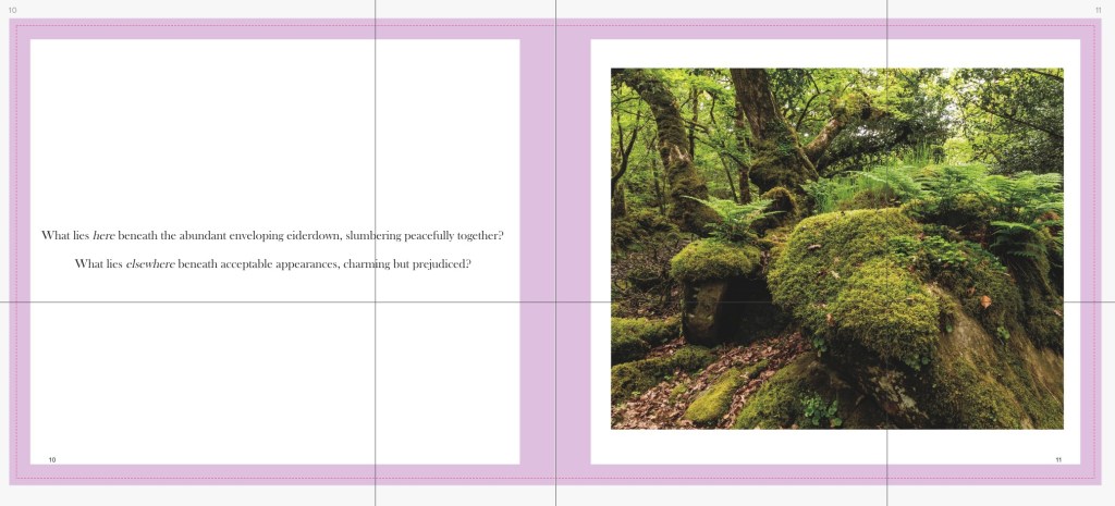
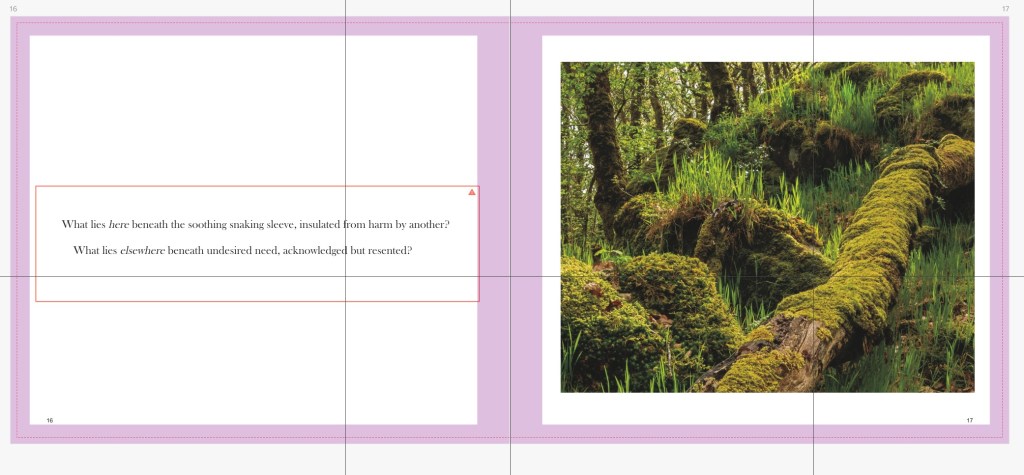
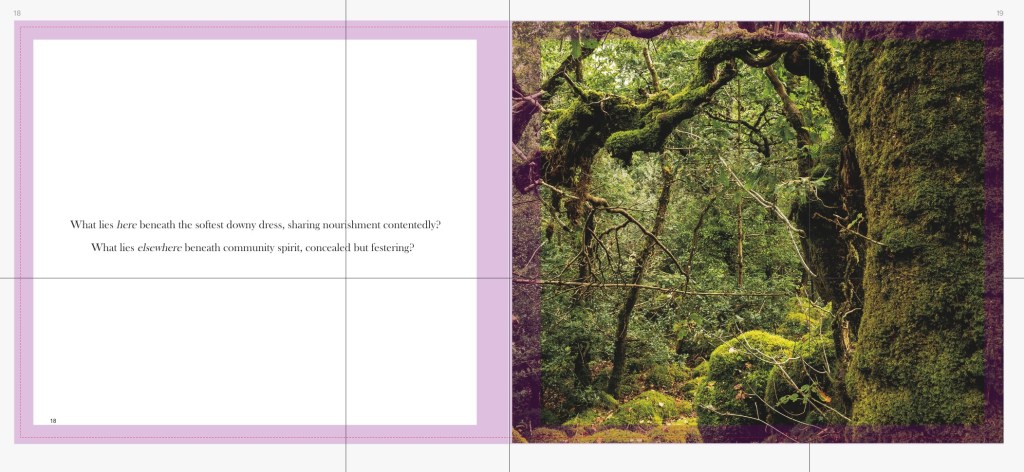
Bow images chosen after editing for SYP:

Made with Padlet

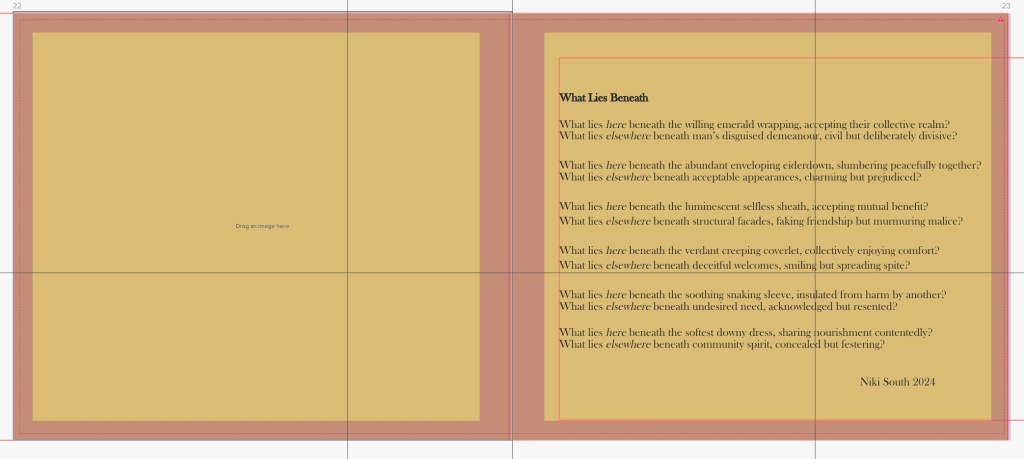
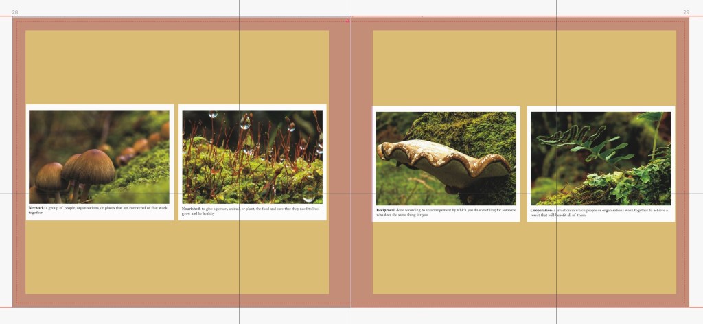
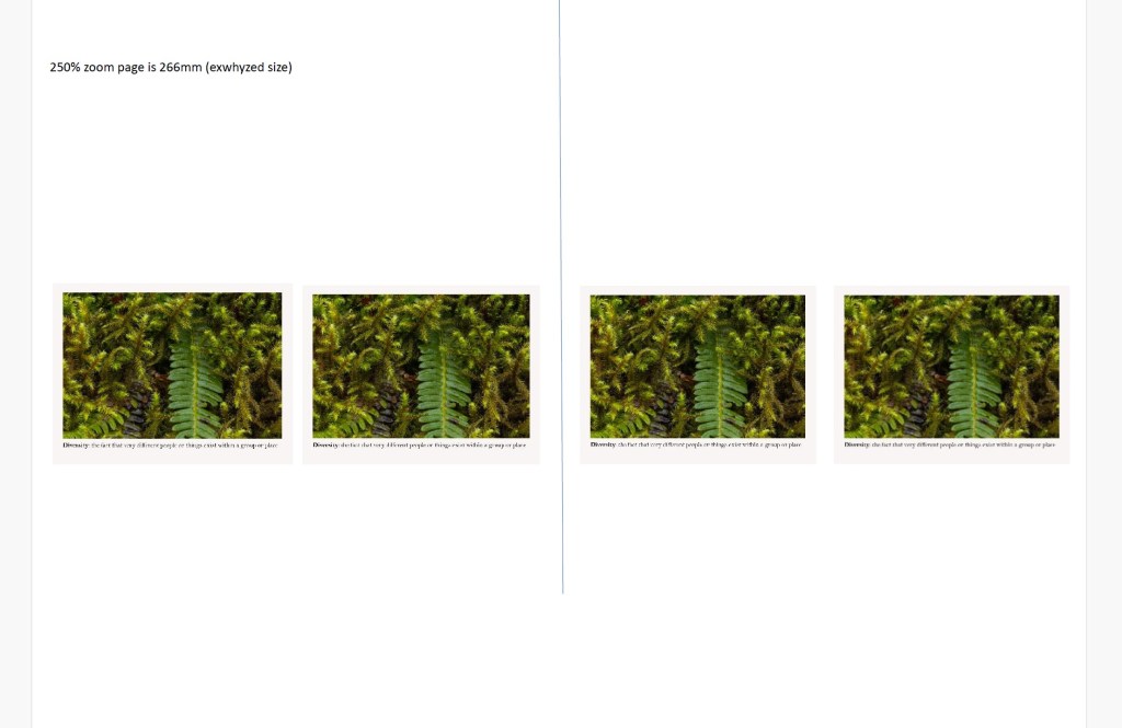
I revisited the ‘footnote images to try the definitions off of the borders of the footnotes:

Part 2: Presenting the body of work images with complimentary text and book design

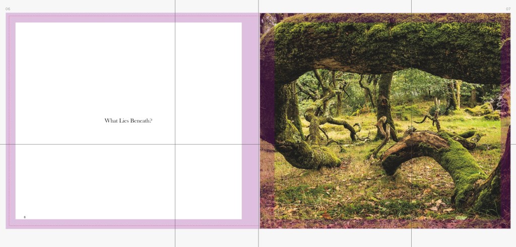
Following this and photobook research I revised the sequencing for the book layout. I wanted a rhythm and a tempo, with quieter images punctuating the ‘louder’ images; a sequence for my narrative.

Made with Padlet

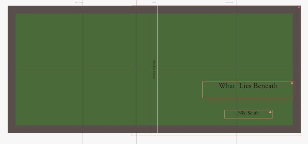
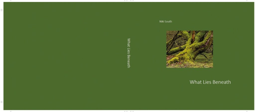
A mock up of book sizes drove my choice of book size: 260mm x 210mm to echo my 5:4 images, and to accommodate the size of the ‘footnote’ images (2 a page).

From here I created and revised book dummies (using Blurb self publisher only to produce PDF review purposes).

Book dummy version 1:

Resulting changes:

  • Moved poem to the back of the book.
  • Changed black text on green background to off white
  • Lined couplet start points up
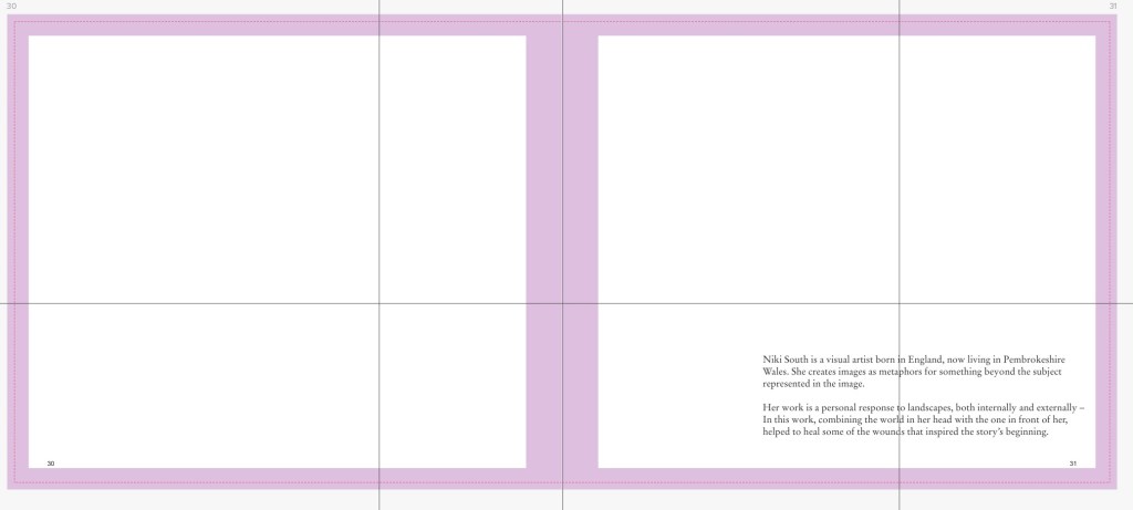
  • Took borders off of images and put text in wrapped text beside them to place vertically
  • Changed ‘footnote’ label to constituents.
  • Changed section break background colour to green

Changes for Book Dummy 3:

  • Title in bold
  • Changed font
  • Changed position of text on cover

Book Dummy version 3

I shared this version with my tutor, and asked:

  • Should I have an image on the front cover? A. Can leave without
  • Are font sizes correct? Advised to keep font as small as readable, will look professional. Great tip & enabled me to reduce the font size of some of the text- done
  • Can I mix fonts headings/subheadings/text? -Took advice to use the same throughout

Also discussed & made some of these revisions in my final book CRS Padlet output 1:

  • make cover margin at bottom larger than top & move text in a little- Done
  • Realign text and try Futura font. I realigned but decided against futura font, I don’t like the’?’ & have alot of them.
  • Chose Calibri light as (similar to futura), Tutor recommended light
  • Do I need the Introduction heading? Check other’s books – Done I changed the heading from ‘introduction’ to ‘Preface’
  • Use thirds to place on page, imagine a 3×3 grid on a page and position elements in the centre box then move a bit upwards eg. p11 -done
  • Make page margins smaller- and text wider -done
  • Page 11 couplets move text lower to 1/3s -done
  • Is subheading, ‘constituents’ too political/formal? – I changed to ‘residents’
  • Footnotes: consider realigning – done
  • Think about how the book will look when pages turn, ensure that all text has the same bottom margin -done
  • Justify to the left, not ‘blocking – done
  • leave more space at bottom of page than top, like a polaroid photo -done
  • Make text 85% black only. This doesn’t conflict with the black in the images and makes the images ‘pop’. I adjusted to 88% black as advised by the printer – done

I revised the previous 3rd draft as above using affinity software with my chosen publisher Exwhyzed.

Final book PDFs:

The revisions I made with creative/artistic choices using feedback and personal reflection took many hours but resulted in a book which complemented the images, set off the narrative of the project and enabled my final outcomes.

SUSTAINING YOUR PRACTICE: ARTIST WEBSITE

To support my work, open calls and publicity I built a web site. I already had a OCA blog, and built a website in March 2024 to host my work for a wider audience: https://nikisouth.myportfolio.com/home.

I built it using Adobe portfolio, so with no annual fee for a domain name and after a few days of research and trials I achieved what I wanted to. It is simple to refresh e.g. my portfolio, bio, CV.

I am aware that my website is a first landing place and should look professional for interested in my work and considered:

Content:

  • It has a landing page
  • About page: With my bio
  • Portfolio page: one for my major project What Lies Beneath and 1 for an earlier work Brexit. Both include introductions to my work.
  • Contact page

Visual strength, I considered: 

  • Considered typeface
  • Layout
  • Colours/tones
  • Navigability is simple and obvious.
  • I checked how my website looks on a variety of devices.

All peer reviewed and spent time looking at other photographers’ websites;  I believe it stands up well against other photographers websites.

As I do not intend to sell my book it will not be encompassed on the website for sale- though in the future I may mention that artist talks are available with a personal showing of the work in a book.

Apparently I can get Get Google Analytics (free) on my site to see where people are visiting from, what content is popular, what search terms people use to discover your site, how people move around the site. I need to look into this.

LO2 coherently present a body of work, making creative presentation decisions that complement your subject and/or your artistic strategies.

SUSTAINING YOUR PRACTICE: REFLECTIONS AGAINST LEARNING OUTCOMES

The brief:

To engage a public audience with my major project – Assignment Four asks me to submit a final draft of my publication, and my promotional material for it, to my tutor for feedback.

(Boothroyd, S. and Alexander, J;83, 2020)

Reference: Boothroyd, S. and Alexander, J. (2020) Sustaining Your Practice Course Manual. Barnsley, UK: Open College of the Arts.

REFLECTIONS AGAINST LEARNING OUTCOMES:

LO1 demonstrate comprehensive knowledge of the professional context(s) relevant to your practice and have an understanding of the professional dimensions that underpin a successful photographic practice

To prepare my photobook I first did much research on photo books both theoretical, see blog post: https://nkssite6.photo.blog/category/sustaining-your-practice/assignments/a4-syp/a4-syp-photo-book-research-colberg/

And against other photobooks:

LO2 coherently present a body of work, making creative presentation decisions that complement your subject and/or your artistic strategies.

 I have prepared a book dummy for review by peers, postgarduates and my tutor: https://nkssite6.photo.blog/category/sustaining-your-practice/assignments/a4-syp/a4-syp-dummy-book/

To do so there were many areas that I worked through to enable the decisions that led to the draft book:https://nkssite6.photo.blog/category/sustaining-your-practice/assignments/a4-syp/a4-syp-summary-of-content/

My learning log for this assignment explains the process I went through to choose my artistic strategies and the process I went through to make my draft photo book, see blog post:  https://nkssite6.photo.blog/category/sustaining-your-practice/assignments/a4-syp/a4-syp-learning-log/

LO3 operate in complex commercial contexts requiring the application of specific interpersonal, professional and business skills within an ethical framework.

I undertook primary research into the self publishing and printing industries: https://nkssite6.photo.blog/category/sustaining-your-practice/assignments/a4-syp/a4-syp-book-pre-printing-notes/

LO5 confidently engage a public audience with your practice and analyse, review and evaluate information relevant to your practice, identifying opportunities for professional development

I have researched, considered and made decisions on how to reach my audience:  https://nkssite6.photo.blog/category/sustaining-your-practice/assignments/a4-syp/a4-syp-publicity-material/

As outlined in my learning log: https://nkssite6.photo.blog/category/sustaining-your-practice/assignments/a4-syp/a4-syp-learning-log/

SUSTAINING YOUR PRACTICE ASSIGNMENT 4: LEARNING LOG PART 2 GOING TO PRINT

Book final revisions and production. All of this achieved with research, tips from others, and liaising with the printer

Following final revisions set out here: https://nkssite6.photo.blog/2025/01/20/assignment-four-publication-draft-learning-log-mark-2/ I prepared the files to go to my preferred printer EXwhyzed my choice of printer previously outlined here: https://nkssite6.photo.blog/category/sustaining-your-practice/assignments/a4-syp/a4-syp-book-pre-printing-notes/      

Summary Exwhyzed: superior quality, wide choice of papers, cover finishes, printed end pages, bespoke sizes (I opted for 263 x 210 mm a 5:4 ratio), uses professional publishing software for files, and is recommended by other OCA graduates.

When using Blurb I have used their own software, however with ExwhyZed I had to use Adobe Indesign or affinity publisher- new territory. Exwhyzed gave online advice on using Indesign to meet their printing specifications, however to subscribe to this software would have altered my historically inexpensive Adobe monthly subscription going forwards, so I sought another option.

Affinity offered a 60 day free trial for their affinity publishing software, and after discussing with Exwhyzed I decided to use this publishing software. Though dreading using it, it was reasonably intuitive, I managed to problem solve using the internet, and by liaising with the printer when needed.

They required 4 files for my book, Cover, front end pages, back end pages and inner 32 pages. All images to be in CMYK not RGB. This necessitated revising my images to this format. I paid for a proof printing so I could check the colour quality of my settings and the images on their paper. I ordered to be with me in a few days when I had finalised the book and could alter images settings if necessary before it went to print.

In affinity I set the document settings for each file, these are the ones I used for the 32 inner pages:

I kept a track of all settings as I worked, as well as font sizes, image box sizes and guideline placements for additional margins. This was all painstaking work and maths was never my strong point, so I did lots of cross checking.

I added in revisions suggested by my tutor eg.

  • Use a light font and as small a font size as possible for reading,
  • line up all bottom margins,
  • increase text margins in some places,
  • reconsider the font used throughout
  • Change the justifying in some places.

See my Tutor feedback blog post for further detail: https://nkssite6.photo.blog/2024/10/06/syp-assignment-4-reflections-on-formative-feedback/

The specifications for the book are:

  • Size 210mm x 263mm
  • Cover onto 170gsm Silk FSC Certified Wrapped over grey board case
  • Gloss Lamination to outer
  • 2x 4pp End Papers printed onto 170gsm Uncoated FSC Certified
  • 32 inside pages onto 170gsm Silk FSC Certified  (9mm spine)
  • Printed in full colour throughout
  • Trimmed, collated and case bound 
  • 32 pages  

The printer was very helpful, for instance I discussed my Tutor’s recommendation of only 85% black text to allow images to ‘pop’more. They advised to use 88% black.

When the proofs arrived, my brightening for print rather than screen was correct in most cases, though some image colours were not quite as seen on my screen. I revised those.

Exporting the files to PDF proved tricky but after some errors, establishing how to get the crop marks for the printers to show (the pdfs were needed as pages, not spreads) this was successful.

PDF print files sent to printer:

I did change the cover slightly the day before I approved the final proof copy, adding an image which I think does make the book cover more intriguing.

Cover:

Inner pages. Note: This File is large and takes a while to load

I ordered 5 copies for which the quote was £256 (as 1 copy was quoted as £228, and negotiated a £10 discount, however the proof prints cost me and additional £32. An expensive publication, but I hope of good quality and a laminated hardback that will take plenty of handling and trips to the woods.

When the books arrived I was disappointed with the quality of the inner pages. I compared to the paper swatches that they sent me and could tell it wasn’t printed on the 170gsm silk I had ordered, I thought it was 130gsm. I contacted the printer and they checked, it was actually printed on only 115 gsm. I also queried the cover quality as I’d ordered laminated; they insisted it was, but when I received the rectified copies, the cover was laminated and I could see the first run was not. They agreed to reprint at 170gsm, but this caused another week’s delay until I’d received the books in correct quality.

Once received I was very pleased with both the quality and the overall book.

LO3 Operate in complex commercial contexts requiring the application of specific interpersonal, professional and business skills within an ethical framework

SYP Assignment 4: Reflections on formative feedback

Assignment submitted 23.8.24

Video feedback Tutor meeting 25.9.24

Background

I shared how I had a slower start to SYP I had gathered momentum over recent months, and all the elements are now coming together which is satisfying. My Tutor commented that this is often the way with SYP.

All the information shared is contained in this padlet already shared with my Tutor: https://oca.padlet.org/nicola514516/syp-assignment-four-publication-draft-9izzyahdg6i9qo1p

Assignment four

I explained that the book draft, press releases and publicity materials that I had submitted have all moved on now since submission to OCA learn 23.8.24. After much peer reviewing I have now prepared the third versions of these documents.

I shared the process that I have been through to produce my book dummy including exploring various printer’s offers in terms of quality and options. I screen shared my book dummy and previous versions, which peers have reviewed and explained some of the changes that I have made as a result.

My tutor reviewed my version 3 draft book and made further suggestions of revisions to it that I will now experiment with before publishing. Within this we covered my questions about font type and size.

Going forwards

My Assignment 5 submission date is 23.10.24, with a fall back of 30.10.24 should I have any unexpected delays (book deliver for instance). Course end date 2.1.25

MY QUESTIONS BEFORE THE SESSION WERE:

  1. Assignment 4 Draft bookQ: Should I put an image on front cover? Q: Are font sizes correct? Can the fonts be mixed between headings/subheadings and text ?
  • Upcoming assignment 5: format of and general questions.
  • Timescale for next feedback.
  1. ASSIGNMENT 4 DRAFT BOOK

Cover:

  • Make more space at bottom margin than top and move text in slightly- done
  • Leave cover as is except realign text and try futura font light. This is elegant and free from associations. I tried Futura font, however I decided against as I don’t like the ‘?’ and there are a lot in my text. I took the advice on using the same text throughout, fairly neutral and light and opted for Calibri light. -done

Intro page:

  • Justify only to the left – not ‘blocking – done
  • Do I need the Introduction heading? Check other’s books – done. Having done this I changed the heading from ‘introduction’ to ‘Preface’
  • Use thirds to place on page, imagine a 3×3 grid on a page and position elements in the centre box then move a bit upwards  Imagine a 3×3 grid on a page and position elements in the centre box then move a bit upwards eg. p 11 -done
  • Make page margins smaller- and text wider -done
  • Page 11 couplets and poetry move text lower to thirds or the bottom of centre – more at bottom -done

Section break: Consider changing the use of ’Constituents’ is the subheading (too political/formal?) for a subheading – This I changed to residents

Footnotes: consider realigning so slight overlap and move text to align with the bottom of images and justify to next to the images – done

      Generally:

  • Think about how the book will look when pages turn, ensure that all text has the same bottom margin -done
  • justify only to right or left – not ’blocking’ – done
  • leave more space at bottom of page than top, like a polaroid photo -done
  • Make text 85% black only. This doesn’t conflict with the black in the images and makes the images ‘pop’. I adjusted to 88% black as advised by the printer – done
  • Take text as small as possible and then increase until readable, the smaller you can go the more professional it will look. This was a really good tip and enabled me to reduce the font size of some of the text.- done

In the following 5 days I revised my book draft with these revisions see my A4 Learning log part 2: https://nkssite6.photo.blog/2024/10/06/sustaining-your-practice-assignment-4learning-log-part-2/

ASSIGNMENT FOUR PUBLICATION DRAFT

A SUMMARY

My Publication draft comprises of the following which can all be found on my padlet at https://oca.padlet.org/nicola514516/syp-assignment-four-publication-draft-9izzyahdg6i9qo1p :

To do this I have gained experience with:

  • Creating a draft book with Blurb as below.
  • Printing software (Blurb Bookwright). I have downloaded affinity software to use with my final book product with Exwhyzed
  • Comparing printer’s capabilities, costings and quality (through samples) ready for my end product: Exwhyzed, Mixam, Blurb.
  • Printer’s design software (moo) when making publicity and feedback postcards
  • Fine- tuned my artist statement and bio, and gained experience numerous experiences of adapting it for various audience
  • Adobe my portfolio when building a website and managing the content. I have been contacted about my work via my website
  • Press releases – by research and writing my own
  • Putting my work out there through open calls and reviewing with peers and postgraduates also. My work is featured over two pages in the August edition of Suboart Magazine, is to be shown at the Glasgow Gallery of Photography in October and was chosen for the Shutterhub 2024 Yearbook.

ASSIGNMENT FOUR PUBLICATION DRAFT

BOOK DUMMY

Below is a PDF Preview on Blurb.

The final book will be printed by Exwhyzed printer with the following specifications:

  • 210 x 266mm Landscape
  • Casebound Book
  • Cover onto 170gsm Silk FSC Certified
  • Hard back wrapped over greyboard case
  • Gloss Lamination to outer
  • 2x 4pp End Papers printed onto 170gsm Uncoated FSC Certified
  • 32 inside pages onto 170gsm Silk FSC Certified  (9mm spine)
  • Printed in full colour throughout
  • Trimmed, collated and case bound

Screen shots of the book dummy on a double page spread with the gutters shown in purple

This is their pdf preview wthout gutter markings etc, but only shows single page spreads:

Cover:

I made sizing mock ups to help my decision making:

  • A: A4 size
  • B: Mixam letter size 279 x 216mm
  • C: Exwhyzed bespoke size 279 x 210mm
  • D: blurb 200 x 250mm
  • E: Mixam 210x 210 mm

The mock up below was to establish the size the footnote images would actually be if on a book 266mm wide and 4 across a 2 page spread.

For further details on my printing investigations and how I arrived at my decisions see:

https://nkssite6.photo.blog/category/sustaining-your-practice/assignments/a4-syp/a4-syp-book-pre-printing-notes/