Video of published book
The purpose of my book:
To combine the images and poetry in a way that offers audiences a platform to reflect on the nature of community. It is intended for two purposes:
- To accompany artist talks in the woodland where shot, with local audiences
- For exposure to professional via open calls, networking and reviews.
EVALUATION:
- I am pleased I paid for a laminated hardback cover as this gives it the durability it needs to be handled and used in the woodland.
- The green end pages give it a professional look.
- The section dividing pages in green provide good punctuation.
- The alignment and margin revisions work well, especially the tip to have a larger margin underneath an image.
- Advice given to print text in only 85% black to help the images to ‘pop’ works well
- The change to a lighter font (I used Calibri light instead of Garamond) is effective.
- The change of label ‘Introduction’ to ‘preface’ in this final version gives a more professional tone to the page and book, as does the considerably shortened ‘preface’.
- The sub title ‘Residents’ instead of ‘footnotes’ or ‘Constituents’ hits the right note.
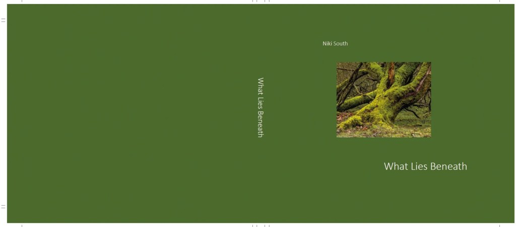
- I am glad that I added an image to the cover, looks more interesting and creates some intrigue.
- The quality when delivered as my order: inner pages silk 170gsm not 115 gsm, and the cover laminated not un-laminated were important and I am glad that I picked these order errors and insisted on a reprint.
Professional feedback:
I showed the finished book to a printer, framer, photobook publisher who was impressed with the design, layout quality and content. He commented favourably on:
- The way that the 85% black text is softer on the eye and makes the images ‘pop’
- The uneven top/bottom margins like Polaroid pictures
- The tone of the green colour used for the cover, end pages and section breaks
- The small size of the text
- The placement of text on facing page not below the images
- That the design complements the subject and message well
Overall he was surprised at the professional outcome I’l achieved whilst self publishing.
Final reflections
Revising the design and product over time seems to have paid off. Some compromises are inevitable. Had the budget been limitless:
- I would have chosen a linen embossed cover, I was quoted an extra £250 for this.
- I would have experimented with end pages and section breaks in a natural brown paper, for texture and look.
However I believe I found the best solutions for my budget for the final product.I paid a total of £278 for 5 copies. Quite an outlay but I budgeted £350 and saved £60 bu using affinity software 6 month trial.
It is a good quality hardback book, with the durability needed for artist talks. It gives the professional look needed for audiences and the final images, text content and overall design exactly meet my intention to provide a platform for audiences to reflect on the nature of community.
PDF Proof copy of book:
LO5: confidently engage a public audience with your practice and analyse, review and evaluate information relevant to your practice, identifying opportunities for professional development
