Study day Bristol Photo Book Fair 24.10.21
This was extremely useful to me on many fronts.
Firstly, the material provided before- hand by the tutor Jayne Taylor on the padlet that she created for the study event.
The pre reading suggested on Photo Books was excellent, see my review on the padlet: https://oca.padlet.org/jayne_taylor2/d4orvu9j0b2o028l
Photobook Reviews
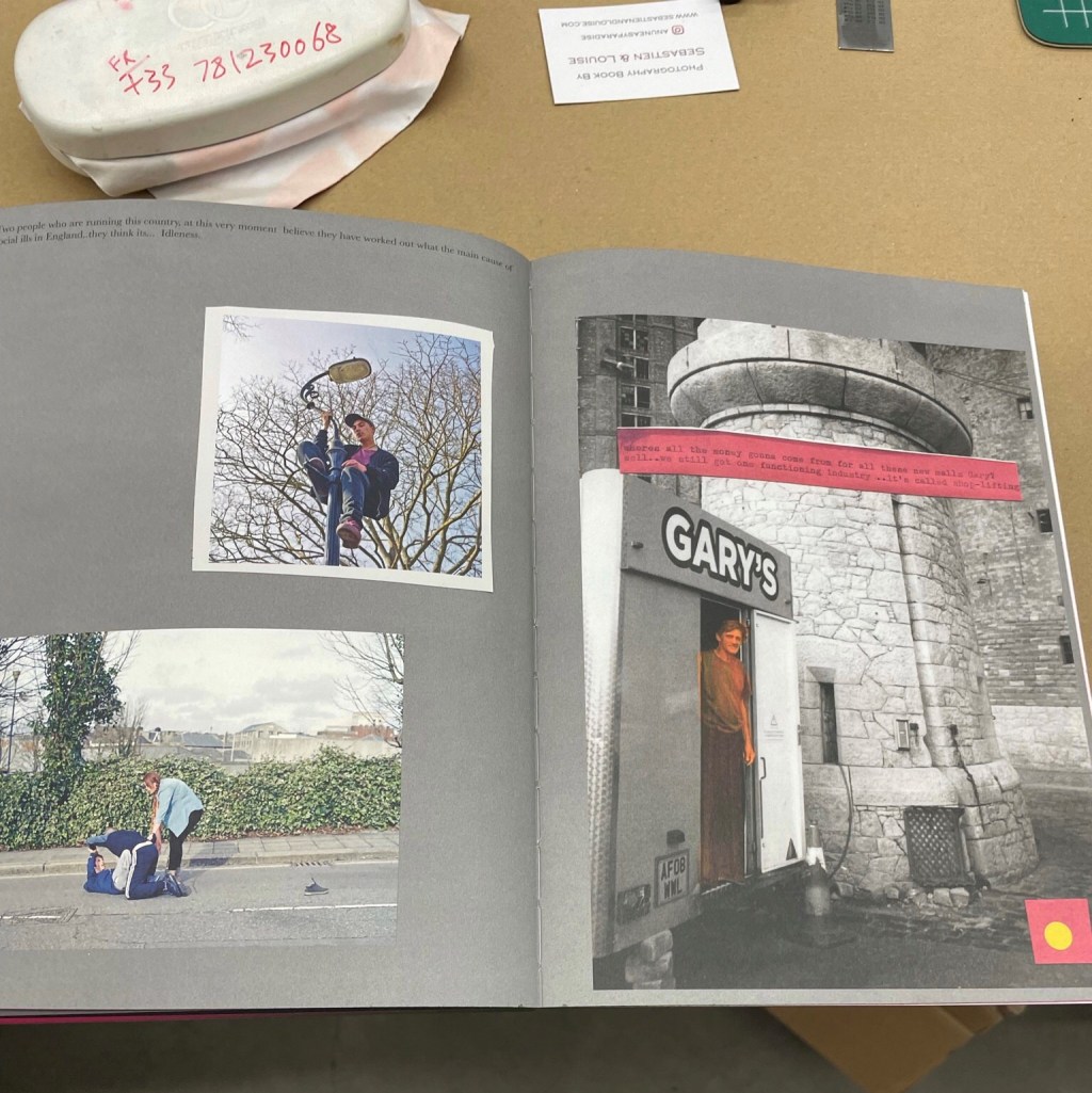
I am glad that I had done the course prereading on Photo books before the exhibition and as I enjoyed the books, I was able to assess the books for different criteria. There were those that I appreciated not for their content or concept but for their design.
There were those the design and their concept fitted.
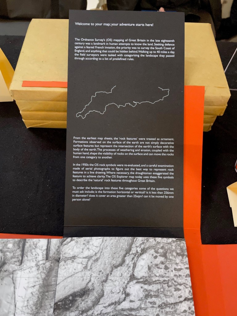
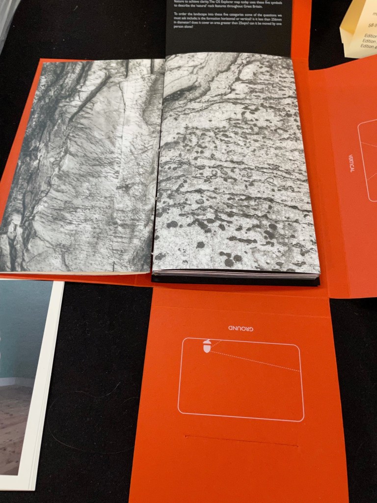
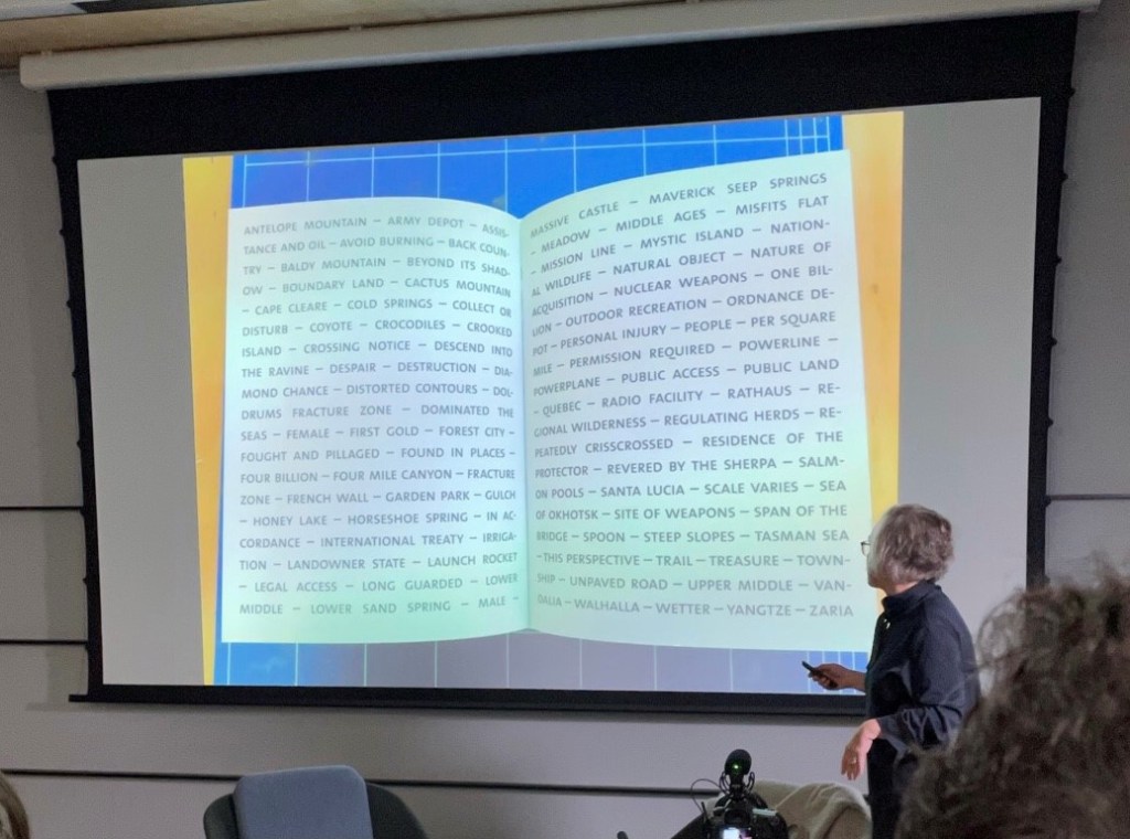
Tamsin Green’s this is how the earth must see itself, was my favourite. She made it whilst repeatedly walking the South Coast of England. It contains her images as well as archival material and uses the Ordinance Survey mapping system and symbols. In her walks she follows rock outcrops and photographs them in different scales. Green says that she:
“oscillates between seeking to know and name the land, and melting into aimless wandering, loosing sense of time and scale. The process of ordering the images into these pre-defined categories throws up questions as pebbles become boulders, flowing water becomes outcrop…As with all classification systems, the rules are subjective, leading to their own telling of the story.”
The handmade book design emulates the shape of an OS map, the haptics has the same tactility and folds. Unfortunately, its price meant that I was unable to buy it to explore it fully, such a shame for me as the content was relevant to the work that I am doing. There is a vimeo video referenced below which takes you through the work, and the beautiful black and white landscape and still life images of rocks can be viewed on her website listed below.
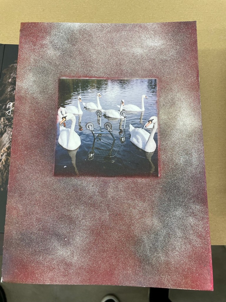
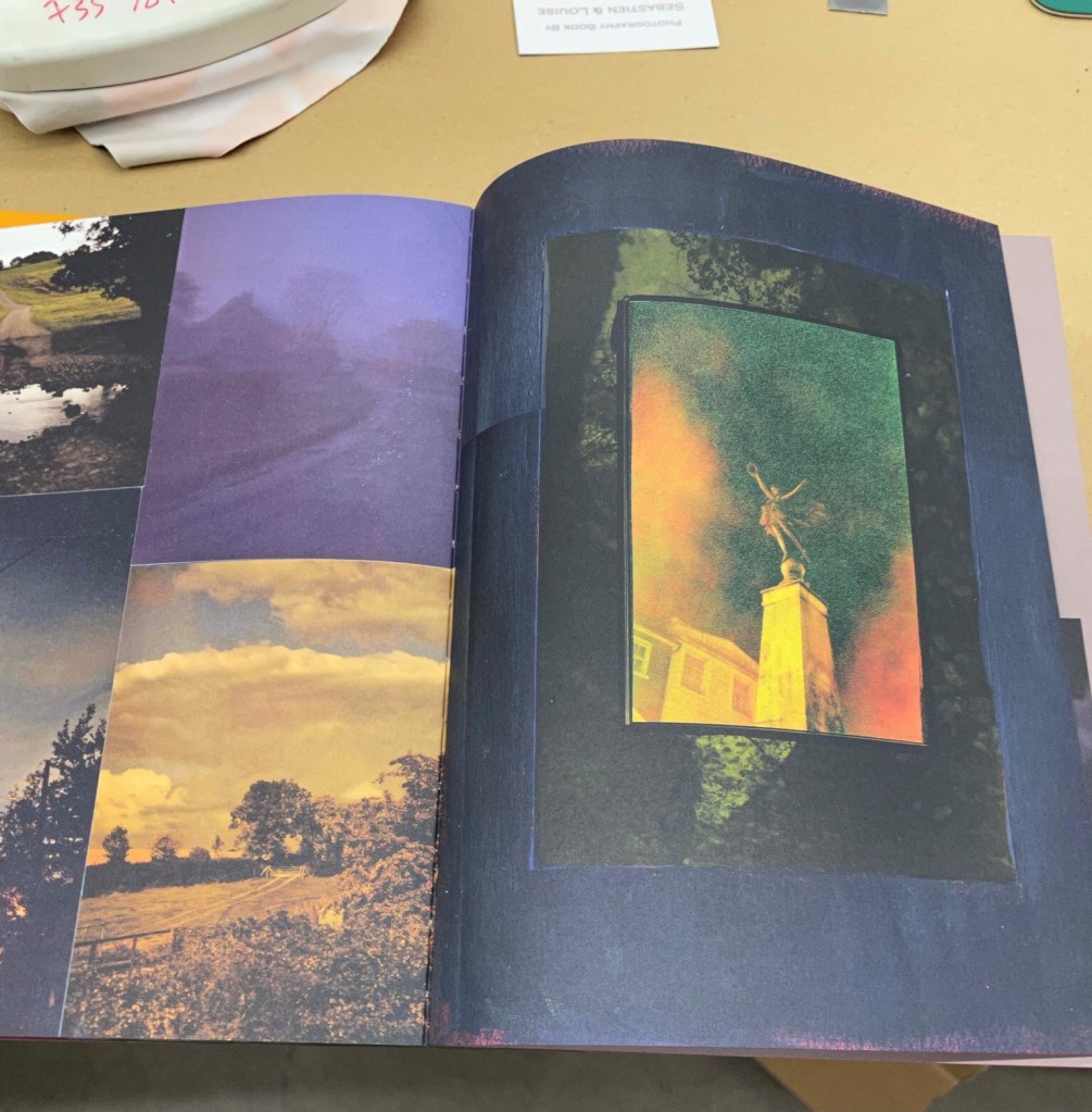
Robin Maddocks England. I was attracted by the tactile and handmade nature of his book, each cover individually spray painted by him, and each with four pages removed by him because he thought the book better without them. I thought that the variety of bold background colours used, and the varied text and image layouts fitted his images which were bold, graphic, and chaotic.
Billy Barraclough’s Murmuration’s, with poems and images of a variety of sizes, where the largest folds out to an A2 image. I would have bought this and been able to describe and comment on it further but unfortunately, he had sold out. From what I remember I think his subject the mass gathering of starlings did suit the book design; murmuration’s come in many different forms and their black and white natural colours was echoed in the black and white minimal book design.
Some designs I noted as interesting were:
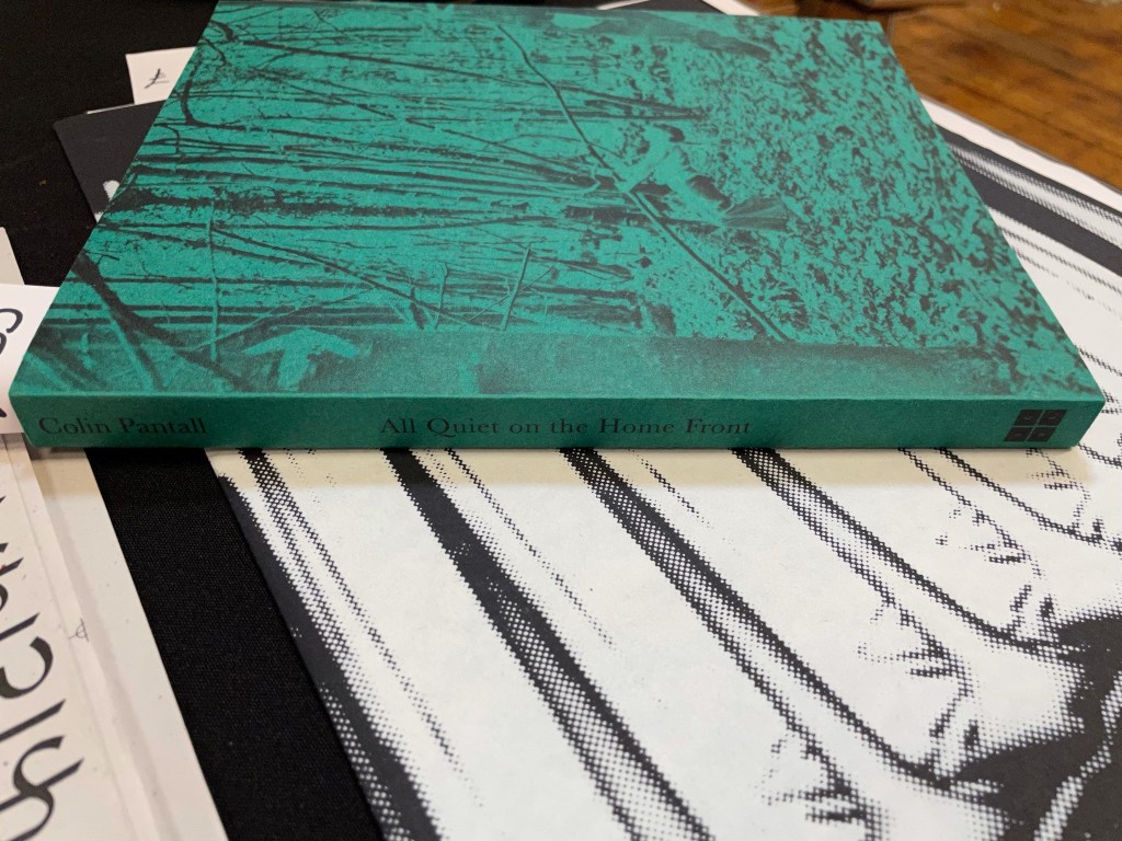
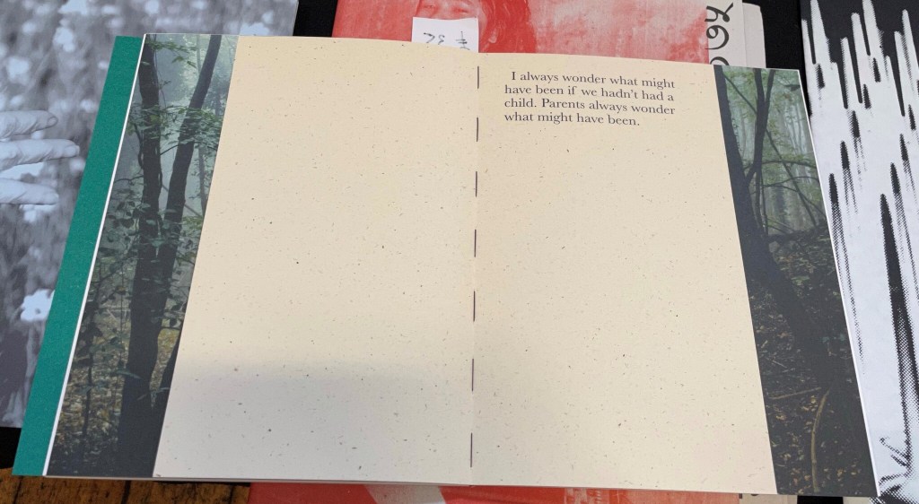
Colin Plantall, All Quiet on the Home front, where I liked the tactile raw, smaller text pages inserted into the book.
There were those that I took things away that were useful to me:
Mark Mattock Spring in the temple of plastic pillars and Where rude boys never think to look, both landscape photography of edge lands. I was taken by the gate folds in the later book of scrubby woodlands. Mattock described to me how he had chosen the gatefolds to emulate the feelings of claustrophobia in those woodlands, and once described this did enhance my experience of his book.
References:
THIS IS HOW THE EARTH MUST SEE ITSELF – Tamsin Green (s.d.) At: https://www.tammidori.com/thisishowtheearthmustseeitself (Accessed 31/10/2021).
Green, T. (2021) this is how the earth must see itself: A walk with Natural Features – Tamsin Green. At: https://vimeo.com/567428495 (Accessed 31/10/2021).
EVENT PRE-READING REVIEW
The history of the photobook provided by David Company (Company, 2014) gave me lots of background information. I enjoyed the discussion on editing photobooks and his view that photographers are generally lousy editors of their own work. His final paragraph discussing a move from the recent widespread use of the term photo book to something more definable was thought provoking. Campany calls for some discipline around the term. Which led me nicely onto my next read below.
Towards a Photobook Taxonomy (Colberg, 2018), made me reflect on what a photo book actually is and I found his categorization really useful:
- Catalog- Structured presentation of bodies of work.
- Monograph- presentation of one body of work, usually financed by the artist.
- Journalistic- text is often heavy and relies on journalist conventions includes Photojournalistic, Documentary, Encyclopedic,
- Lyrical- the images are foremost, and the text is separated, if it does include an essay it is separated. Four types are suggested:
- Poetic, without a story but with facets of one, close to a monograph, interpretive.
- Elliptical, narrative ambiguity, not a linear story, possibly with visual symbols.
- Linear, combines elements of the poetic and elliptical but reliant on its sequencing, more easily decoded.
- Narrative driven: Text is often integral:
- Photo novel.
- Linear.
- Elliptical. Subjective documentary.
- first person narration
At this stage I would be most interested in Lyrical, elliptical or a narrative driven elliptical or lyrical for my current work.
The Photobook (Steptoe, 2020) also discussed the history of the photobook. But goes on to explain the history of photobook events, sales, fairs, competitions, and exhibitions. Again, it was the discussion it provided on the nature of photobooks which caused me to reflect on them in a new way. I had not thought before about the difference between a book of photographs and a photobook. These are set out here as that the photobook should have a purpose or concept, use physical prints when edit and sequencing, and have limited text, no text or a large amount of text.
In terms reviewing a photobook the description of the process of assessing them in competitions was useful: The value of the concept, the photography, the sequencing, the placement and design of the book spreads and the total look and feel of the book. It was also good to read the view that in terms of the form of the book almost anything can be called a book, even single or folded sheets. If I am to produce a photo book, I will look deeper at this and read Understanding Photobooks (Colberg, 2016).
Overall, I now realise I’d not really considers what makes a photobook, and the varied forms that they can take. This was useful to reflect on before going to the event but also will be invaluable should I decide on a photobook as an outcome for my Body of Work.
References:
Campany, D. (2014) The ‘Photobook’: What’s in a name? – David Campany. At: https://davidcampany.com/the-photobook-whats-in-a-name/ (Accessed 31/10/2021).
Colberg, J. (2016) Understanding Photobooks: The Form and Content of the Photographic Book. (s.l.): Taylor & Francis.
Colberg, J. (February 26, 2018) Towards a Photobook Taxonomy. At: https://cphmag.com/photobook-taxonomy/ (Accessed 31/10/2021).
Steptoe, B. (2020) The Photobook. At: https://rps.org/media/bj3ediin/photobook-article-apr-2020-pdf-for-issuu.pdf (Accessed 31/10/2021).
HELEN SEAR TALK AT BOP 24.10.21
Her talk was more useful for my practice and was about a work much different to that which I had researched on her previous work on her website, where it describes her work as focusing on the co-existence of human, animal and natural environments with a rooted interest in magic, realism, surrealism and conceptual art. Particularly of interest to me is her description of photography which “often challenges the dominance of the eye and the fixed-point perspective associated with the camera lens, and explores the potential of the artwork to activate and elicit feeling” (Sear, 2011). I must research her work more deeply.
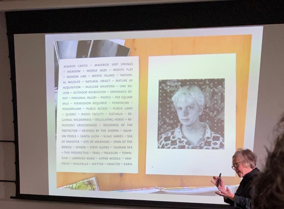
Her talk at the BOP was on the development of her new book Era of Solitude (Dewi lewis publishing, 2018). The project was based in a warehouse premises of The Scrap Exchange, an organisation dedicated to re-diverting surplus materials from landfill. Sear saw it as a microcosm for our human relationships with, and impact on the environment and our immediate surroundings. In a makeshift studio she took portraits of visitors with hands holding chosen objects and photographed the place.
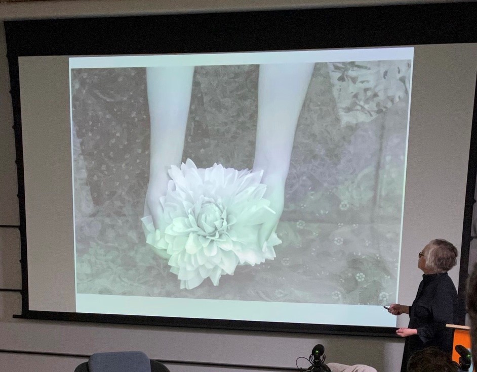
(Dewi lewis publishing, 2018)
She didn’t begin with the idea of making a book, it developed. She asked herself, how do you archive/capture/arrange something? Her process was intriguing:
How do you archive/arrange something?
- She put her own story in text
- Used layering with scrap fabric as a process to bring texture to portraits
- To connect BW and colour images used off white backgrounds
- She used monochrome portraits to reduce visual overload which she described as paring back
- I took away her idea of putting associated words densely on a page, as a strategy.
- She made dummy books before choosing the format.
Also of interest to me is her current work in the ancient forests in France photographing the foresters’ marks on the trees.
My response
- It was good to hear from an artist that an idea developed that was not the road they intended to go down initially; meaning when they had the subject, they had no idea how they would execute or present it – comforting to my situation.
- Dummy books
- How to bring texture to work with fabric, collage and layering.
References:
Sear, H (2011) Helen Sear. About At: https://www.helensear.com/about/ (Accessed 08/11/2021).
Dewi lewis publishing (2018) Era of Solitude. At: https://www.dewilewis.com/products/era-of-solitude (Accessed 08/11/2021).
Next post: https://nkssite6.photo.blog/category/reflective-journal/exhibition/helen-sear-within-sight-23-10-21/
