PHOTO BOOK RESEARCH
RESEARCH
I have visited several book fairs, most recently Ffoton in Cardiff and BOP in Bristol. I have a good collection of photo books of course and keep up to date with those published and online reviews.
My latter period of research into photobooks coincided with my research on my A3 enquiry into printers v publishers.
I am concerned in this research how the a subject of a photobook relates to its physical item, rather than reviewing books for their art/text content. I have sought some books of a landscape/equivalent subject matter and some that I like the aesthetics of. I have looked at the images have been assembled, how rhythm and tempo are achieved, and interest is maintained .
My inspiration:
Jem south Four winters (2021): hardback, 300×230, 124 pages, linen cover, embossed title.
This is a ‘clean’ read. The images are all aligned and are mostly on the right pages. He uses white pages with titles to separate elements of the book. There are no page numbers and no image titles or captions. The colour images work well on this silk paper.
Southam, J. (2021) Four Winters. Stanley Barker. Scotland.
Jeffrey Conley. The shadow’s veil (2024). Hardback, 104 pages, 305mm x 355mm, linen cover. The book is a collection of observations about the unfolding of days. It is black and white, and again fairly ‘clean’. The images align on pages except for some full bleeds. I particularly like space around the smaller images, it seems to bring attention to them.
Ross, E. (2024) The Shadow’s Veil. At: https://biblioscapes.com/library/the-shadows-veil (Accessed 13/08/2024).
The Land is Yellow, the Sky is Blue. (2023) Marc Wilson. Self-Published. Softback, 108 pages, 200mm x 250mm
‘Is based around a small village in central Ukraine. It and text combines photographs with text written in the shadow of the current war. It has dark end pages printed on in white. Images are a variety of sizes, generally aligned on the right pages apart from those that spread across 2 pages. Some of the images have too much white space around them.
Ross, E. (2024) The Land is Yellow, the Sky is Blue. At: https://biblioscapes.com/library/the-land-is-yellow-the-sky-is-blue-1 (Accessed 13/08/2024).
Roots & Bonds (2022). Regina Anzenberger. 112 + 16 (addendum) pages.
This is a beautiful book with a hard cover and American dust jacket, thread binding. Inside Paper: Munken Lynx 150 gr Cover Paper: Arctic Volume White 130 gr. Cover: 2 mm cupboard + 300 gr. grey carton. Book Cloth. It however signed and expensive so the materials used can be justified. The fact that she is a fine art photographer shines through.
Extensions of photographs with hand drawing, mash-up of the representational and the non-representational. Pace and sequencing of this photobook is varied and engaging, so the reader doesn’t know what the following page spread will reveal – Single images, paired images of the same subject, montage of print and objects, full page bleeds or a photographic image spanning the the two pages with a classic white border. The book is Smyth sewn, which is good for a double page spread where none of the photographic content is lost in the middle gutter.
I like the variety of alignment and sizing of the images, though I don’t like it where two are on facing pages. She does use 4 smaller images on a two page spread as I intend to.

And see the third in her series that continues her investigation of a riverside park in Vienna: Root & Waltz, (2023).
Roots & Bonds (signed + extra booklet) (s.d.) At: https://www.anzenbergergallery-bookshop.com/book/3011/roots_&_bonds_(signed_+_extra_booklet_-_preorder)-regina_anzenberger (Accessed 13/08/2024).
Root & Waltz, Regina Anzenberger (2023). Self-Published (AnzenbergerEdition), Hard cover with (American) dust jacket over boards, thread binding (Smyth sewn), signed and numbered edition of 350 copies.
Stockdale, D. (2023) Regina Anzenberger – Roots & Waltz. At: https://photobookjournal.com/2023/11/11/regina-anzenberger-roots-waltz/ (Accessed 13/08/2024).
Brydon. A (2023). As We Wander. Another Place Press. Scotland – Softcover, 40 pages,150m x 200mm
Printed image on cover, black and white landscape images, varied image size and placement. I love the work of Brydon and his colleagues who work with the inside the outside collective. Again, this book appears ‘clean’. No page numbers, no captions. The black and white images work well on what looks like uncoated paper. There is something about the variety of image placement that sits well with me; images are aligned except where they spread across 2 pages or are full bleed. Unusually I don’t object to there being at time 2 images on a double page here.
Ross, E. (2024) As We Wander. At: https://biblioscapes.com/library/as-we-wander (Accessed 13/08/2024).
Passage. Guy Dickinson (2022). Publisher Another Place Press, 245mm x 200mm.
Another contributor to the inside the outside collective, Dickinson’s photography attracts me. This is a softback and in black and white but it’s simplicity attracts me. The images are either full bleed or for the first part of the book have a white space around the images up from the bottom of the page. This irregularity in placement draws you to them.

Ross, E. (2022) Passage At: https://biblioscapes.com/library/passage (Accessed 13/08/2024).
Cubby’s Tarn. Joseph Wright (2017). Publisher JW editions (himself), Edition Size 500, 240 x 325 mm, Approximately 80 Pages. Hardcover.
Another contributor to inside the outside collective whose work I admire. This book I own a copy of, its most things that I love. Linen foil embossed cover. Natural brown paper end papers and section separators -simple white pages otherwise, with images variously placed and sized.

Ross, E. (2020) Cubby’s Tarn. At: https://biblioscapes.com/library/cubbys-tarn (Accessed 13/08/2024).
Nicki Gwynn-Jones (2018) Self-Published, 305mm x 240mm, 96 Pages, Hardcover.
An example of a larger landscape book, which I’m not keen on though it does accommodate 2/3 images easily side by side on a page. I don’t like the printing on the inside back cover, it makes the whole book look poor quality and self-printed.
Ross, E. (2023) In The Dreamtime. At: https://biblioscapes.com/library/in-the-dreamtime (Accessed 13/08/2024).
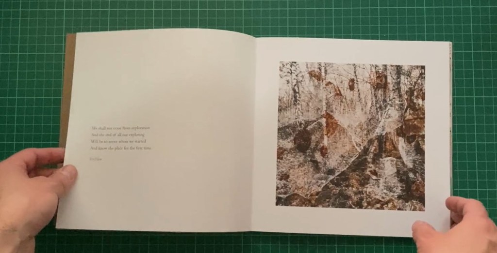
Hidden Layers of Perception. Alexandra Wesche (2022). Self-Published, Edition Size 25, 210mm x 210mm, 40 Pages, Softcover.
The images are multiple exposure photographs taken in a forest. I am amazed this is self-published. The design and papers are exquisite., she has even been able to use some transparent overlays. I’d have thought it handmade except that it is an edition of 25 copies. I love the cut-out cover, and some variety of image size. No page numbers or captions and minimal text.


Ross, E. (2022) Hidden Layers of Perception. At: https://biblioscapes.com/library/hidden-layers-of-perception (Accessed 13/08/2024).
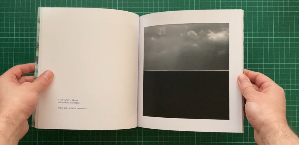
In The Offing. Fiona McCowan (2022). Self-Published, 210mm x 210mm, 52 Pages, Softcover.
Once again I am drawn to a square book. The printed cover this time looks classy. Images of the sea and its horizon are aligned on the pages and either facing or on the right page. The text is bottom left on facing page and section pages have text to the right and not too large.

Ross, E. (2023) In The Offing. At: https://biblioscapes.com/library/in-the-offing (Accessed 13/08/2024).
Meadow Nicholas Pollack (2023) Hardcover book, Offset printing, 112 pages; printed in Italy by Trento,Paper: gardamatt art 150g/m, 10.25 x 8.25 inches.
His book of images of places and portraits are mostly aligned, no page numbers or captions.
Stockdale, D. (2023) Nicholas Pollack – Meadow. At: https://photobookjournal.com/2023/10/16/nicholas-pollack-meadow/ (Accessed 13/08/2024).
Blue Violet. Cig Harvey (2021). Publisher Monacelli Press, 231mm x 288mm, 208 Pages, Hardcover.
I visited this book as Cig Harvey’s ‘You an orchestra you a bomb’ is my favourite photobook that I own – more on this to come.
Blue violet has a printed cover, the whole book is an assault by colour on your senses, just as the above book. The silk paper does pop the colour. I should consider printing my end pages/section pages in a strong colour (Tabacco?) and printing text in a lighter colour? Just a thought.


‘You an orchestra you a bomb’ (2017) Schilt Publishing; 144 pages, 230 x 23 mm.
Is again a colour assault on the senses, with a lovely linen cover in a vibrant yellow. Again with deep coloured pages every so often and printed on lustre paper.
Harvey, C. (2017) You an orchestra you A bomb. Amsterdam, Netherlands: Schilt Publishing b.v.
Ross, E. (2022) Blue Violet. At: https://biblioscapes.com/library/blue-violet (Accessed 13/08/2024).
My takeaways – what I like:
- I could use a square book and take my full bleed images across the page into the other page, but 210 x 210 (exwhyzed the maximum size I can afford) is too small to take my footnotes side by side and be able to read the definitions, and Mixam 300x 300mm (the next size up is too large). I also want to accommodate effectively my 5:4 ratio images.
- Linen embossed cover, but that’s out of my budget.
- Natural paper end pages and section breaks (can Exwhyzed do?) or deep vibrant colour
- White pages
- Regular alignment of images with only a few breaks
- ‘clean pages’ no page numbers or captions
- Space around non bleed pages
- Silk paper
- 1 image only per double page – apart from the footnotes which are a different enitiy.
- Consider placing the medium sized main images up from the bottom – not even
- Text fairly small
I need some irregularity to make the eye work, I know that deviating from an A4 or A5 format does make the eye work and engage you. I need to ensure that the pace and sequencing of this photobook is varied and engaging.
